Canadian consumers won’t accept anything less than delightful mobile experiences. Here are seven tips and examples to help your brand meet—and even surpass—today's lofty mobile expectations.
When Canadians turn to their phones for information, they want it fast and seamless. Fifty-five percent of Canadian smartphone owners expect a mobile app or site to work as well as a desktop site does.
Expectations for brands to deliver delightful mobile experiences are higher than ever, and meeting those needs is sometimes just about making small but impactful changes to your mobile site or app.
Here are seven tips either to get you started or help you refine your mobile experiences to delight consumers when they turn to mobile in those I-need-it-now moments.
1. Keep calls to action front and center
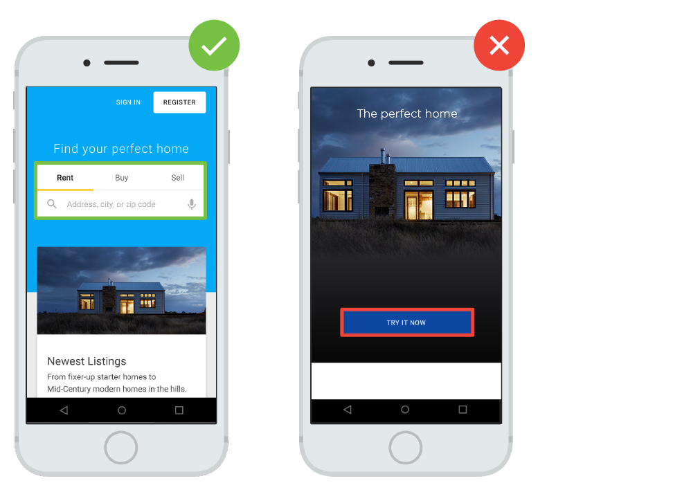
Focus your homepage on connecting users to the content they're looking for immediately. Make secondary tasks available through menus or "below the fold," the part of the site or app that users can’t see without scrolling down.
2. Don't let promotions steal the show
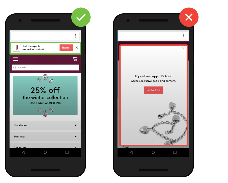
Large interstitial ads such as full-page promotions that hide content or prompt users to install an app can annoy users and make it difficult for them to perform tasks. Sites that use intrusive interstitial ads may also experience a negative impact on their search rankings.
3. Make site search visible
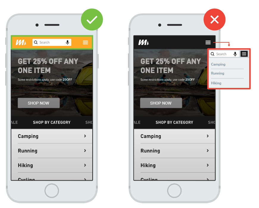
Users looking for information usually turn to search, so the search field should be one of the first things they see on your page. Don't hide the search box in an overflow menu. Most importantly, make search results relevant for users, so they can get where they need to go, quickly.
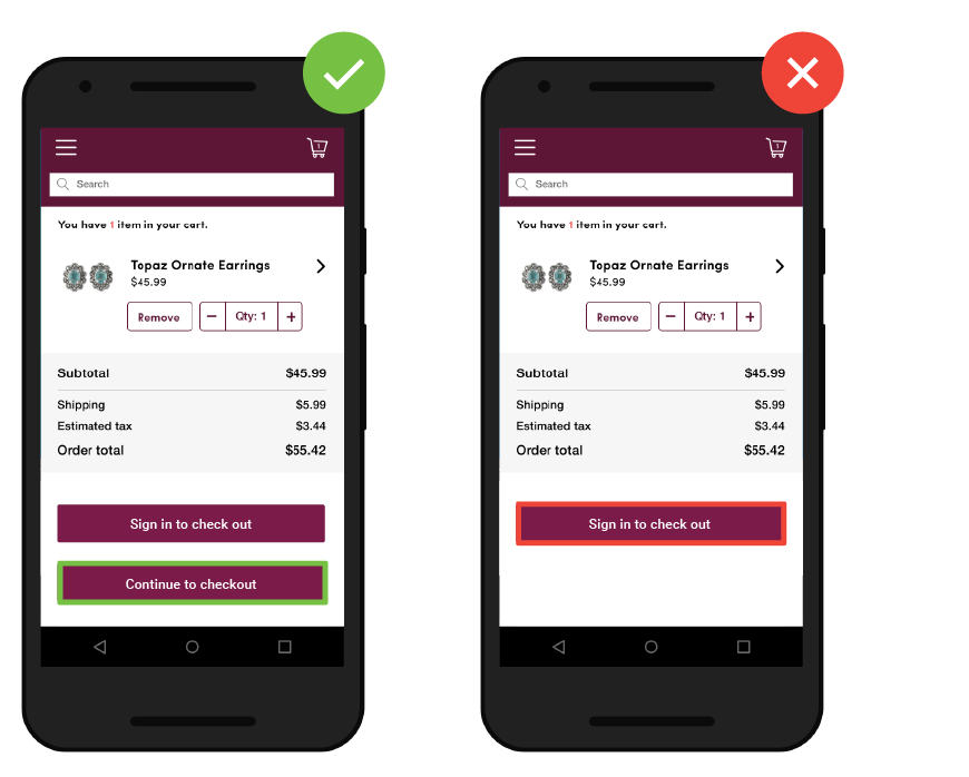
4. Offer convenient check outs
When users are ready to buy, make it easy on them. Sites that force users to register for accounts when they make a purchases, or that don't have multiple payment options, frustrate users.
5. Design efficient forms
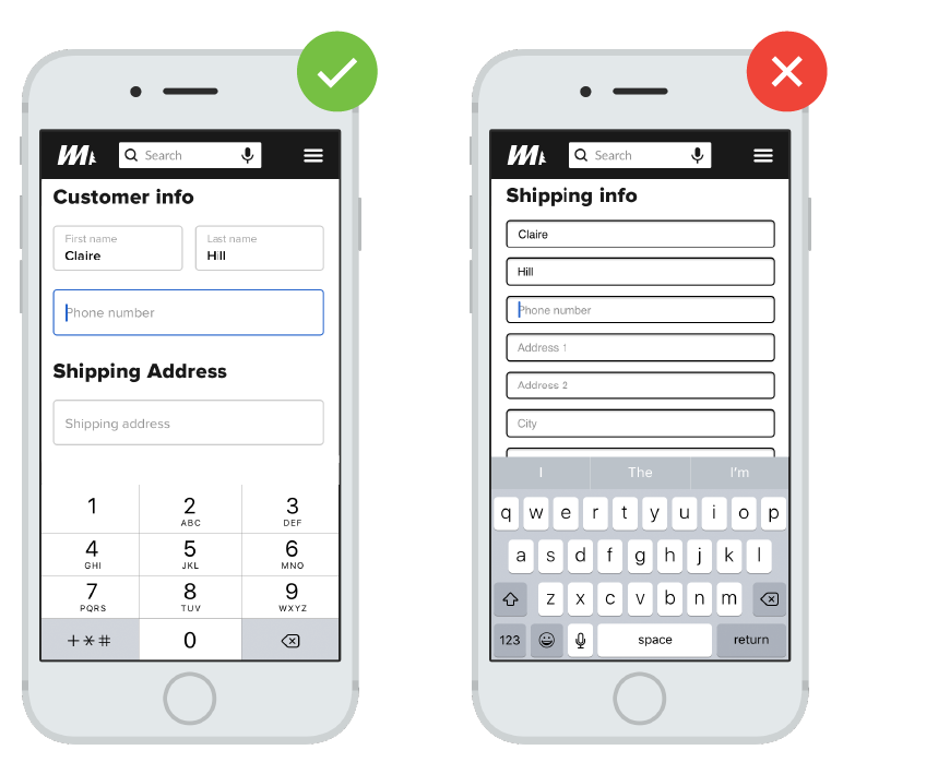
Minimize the number of fields in your forms, and autofill information wherever possible. Using clearly labeled progress bars will help users get through multi-part forms more easily.
6. Plan for cross-device conversions
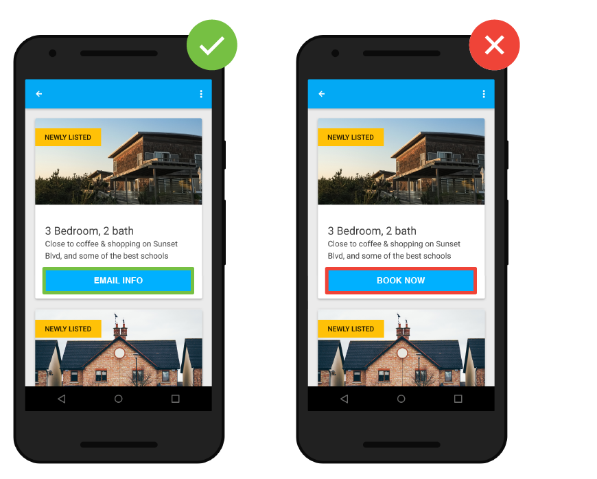
Allow users to share information across platforms and devices. For example, a simple call to action encouraging users to share vacation details with their friends or families before they book, or allowing users to save builds when they price out new cars, could result in conversions at later times on other devices.
7. Optimize for speed
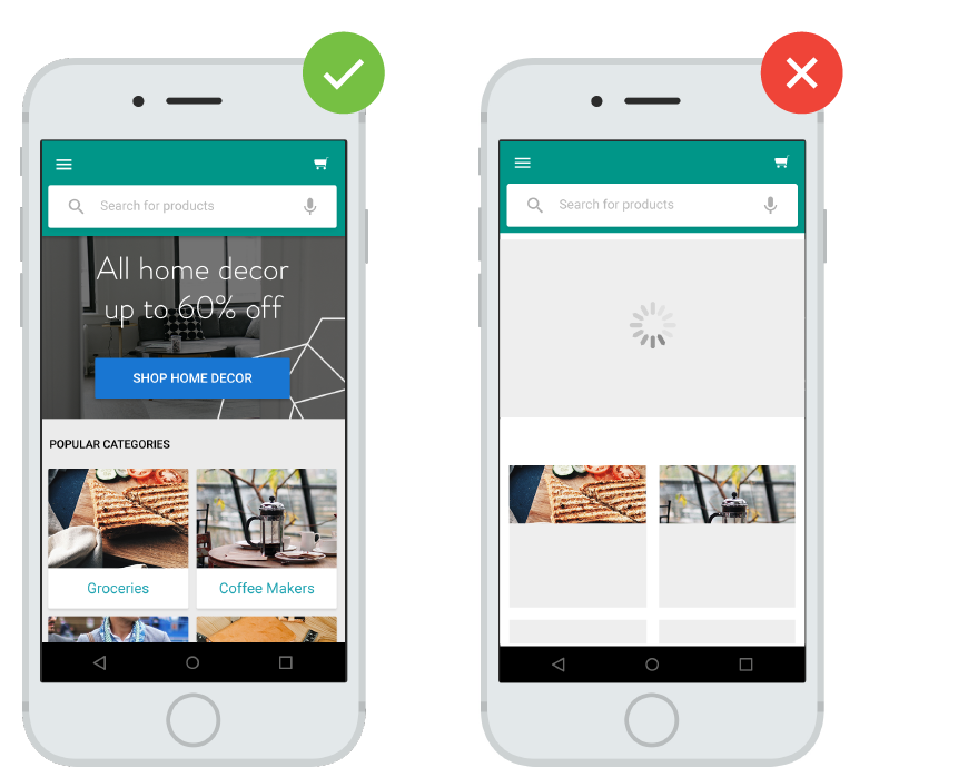
Speed is one of the most underrated aspects of the mobile site experience. A site with fast load times and responsive animation and scrolling keeps users engaged. As page-load time increases from one second to five seconds, the probability that a user will bounce increases by 90%.1
Resources to help you act today
Here are some helpful resources as you start building—or refining—your mobile experiences.
1. Refer to our 25 Principles of Mobile Site Design for more ways to delight users and drive conversions.
2. Check Test My Site to see how your site scores on mobile-friendliness and speed.
3. Consider creating a Progressive Web App for a fresh, responsive mobile site.
A great place to start is to compare these tips to your current mobile site or app. Identify any gaps, test and track results using a small percentage of your site traffic, make the necessary changes, and you'll be well on your way to more delightful mobile experiences for consumers.


