Neil Schwarz is a director at Cxpartners, an experience design consultancy that works with Google to help brands succeed on mobile platforms. Ayelet Lazarovitch is a product experience specialist and co-founder of User Lab at Google, which specialises in user research.
How people interact with your brand online — how they explore and evaluate options, from browsing to check-out — is fundamental to your business success. But when it comes to mobile shopping, you’re probably overlooking some common pain points that are hurting the brand experience, and hitting your bottom line.
User experience testing is the solution. It might sound intimidating, but it doesn’t have to be. Just a few participants are needed.
Google and Cxpartners have conducted over 200 user-testing workshops across 19 countries in Europe, the Middle East, and Africa for clients ranging from florists to financial service providers. These workshops have led to amazing results — with brands often reporting double-digit increases to their mobile conversion rates after making the necessary changes.1 (In one instance, one firm nearly tripled its conversion rate).2
The basics of user testing
User testing is pretty simple — it’s about watching real customers think aloud while navigating your site — and it’s beneficial for three key reasons:
- It’s insightful in a way that data analysis alone is not. We consistently find that the insights gained through user testing tell us more than simple data. “The data tells you what users do, while user testing tells you why they’re doing it,” explains Refael Bitton, co-founder of Google’s User Lab.
- It’s impactful. It uncovers misconceptions about how users think and interact with brands, which encourages teams to refine their approach.
- It’s cost effective. Research shows that you can speak to as few as five user testing participants to draw out meaningful insights. Plus, we’ve proven that remote testing works during COVID-19 restrictions.
Over our years of workshops, we’ve discovered some persistent user experience pitfalls affecting a wide range of brands and industries. Here are some of the most significant issues we’ve found:
Users struggle to find your products
One of the biggest problems brands face, particularly in retail and travel, is product discovery. Users have developed preferred, familiar methods to navigate large product categories, and anything that hinders this can cause people to struggle. Having the right navigation and filtering systems are absolutely crucial. Just a few tweaks can make a world of difference.
For example, global fashion retailer H&M had been trying to understand why its mobile sales were lagging for baby and child apparel. Our user-testing workshop led to a big ‘ah-ha’ moment.
“We discovered that the navigation on our mobile site was confusing parents,” said H&M’s product designer and navigation specialist, Martin Lechev. “We had categories including ‘Newborn’, ‘Babies’, ‘Kids’, and the special H&M-branded section, ‘Kids Exclusive’. These descriptions in the navigation were frustrating for parents because they weren’t sure where to start their search. We were investing in this segmentation and branding strategy, but we found it wasn’t working. This was a big eye-opener.”
The team simplified its navigation so there were only two categories: “Babies” and “Kids”. Filtering options were improved to help shoppers find the right sizes, and the team also added a new filter so parents could find clothing made with organic fabric.
“I was not aware of how important fabrics were for children until I watched people navigate the site,” said Lechev. “This was a great lesson for us and helped us enhance our communication.”
Your brand doesn’t stand out
It’s crucial to show people what makes your brand stand out from the competition. This isn’t easy for brands to convey on a small smartphone screen. People need reassurance from your mobile site: are you the most luxurious brand in your industry? Do you offer the best service? Or are you the cheapest?
Meal-kit provider HelloFresh prioritised refining its mobile site after seeing 59% of searches for “meal kits UK” came from mobile.3 The team joined our workshop earlier this year with the goal of better understanding peoples’ needs. In our session, participants had all previously heard of the brand, but didn’t understand what made HelloFresh stand out from competitors. When they used the mobile site, they didn’t understand the flexible offerings, they missed crucial information about cancellation options, and they misunderstood how many recipes were available.
These findings led to a clear action plan for the HelloFresh team: stand out by showcasing their unique, flexible offerings. This involved giving more prominence to wording such as “No commitments”, providing a broader range of categories for filtering recipes, and introducing the meal plan size customisation tool earlier in the customer journey.
“It was so important to watch customers as they navigated through the site. We saw how they were hesitant to commit to purchasing, in some instances, so we knew we had to properly communicate information about cancellations,” said Idan Mouallem, associate director of product at HelloFresh. “At HelloFresh, we focus on flexibility for customers. That sets us apart. Landing this message is crucial, and it’s something we’re continually working on.”
Your brand doesn’t show relatable information
Shoppers need the right information to make a purchase. The stakes are especially high for big-ticket items, and customers want a complete picture of the benefits. Yet many brands inadvertently make it difficult for people to fully understand critical information, causing potential customers to leave in frustration.
Dutch e-bike brand VanMoof was expanding in Germany and wanted to increase purchases on its mobile site. Our workshops revealed that people didn’t always fully understand the product offering and features, since e-bikes are a relatively new product category. For example, users became confused by the technical language around the built-in batteries and the easy-to-use locking system, called a “Kick Lock”. Despite the usefulness and premium quality of these features, the benefits were easily overlooked and misunderstood on the mobile site.
The team responded to the user workshops by reworking the site to focus on relatable, ‘human-centric’ language and imagery. For example, they showcased photography with e-bikes and riders, and pushed down the technical language for the more experienced e-bike shoppers. The team also worked with models from a range of backgrounds to ensure the brand connected with a wide audience base. These changes significantly improved the way customers understood and related to key benefits, accessories, and offers.
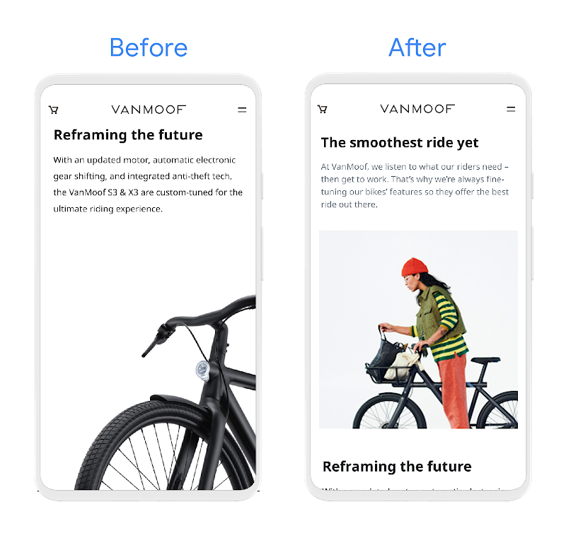
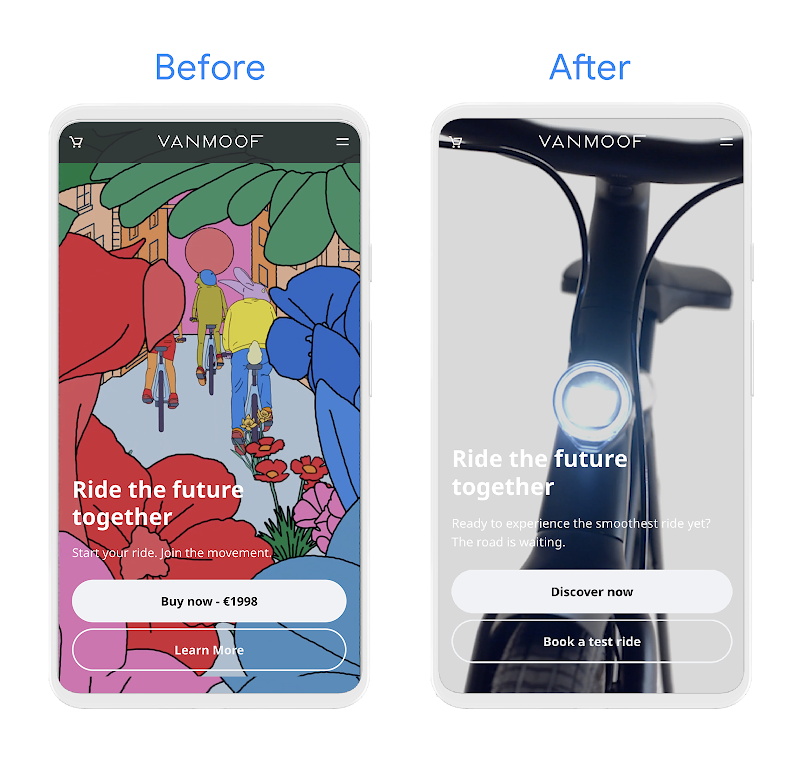
VanMoof also cut out abstract imagery to focus on the e-bike design. Plus, it replaced the prominent ‘Buy now’ button with ‘Discover now’, inviting users to explore all the benefits before committing to an e-bike purchase.
The findings from the workshop ultimately helped the whole company become more invested in the marketing process. “There is a great flow of ideas across the company and we realised we weren’t the only ones willing to experiment with the site,” says VanMoof Growth Marketer, Dayana Simeonova. “We now encourage all kinds of people across the organisation to share suggestions to improve the site experience.”
You’re asking for too many personal details, too soon
Privacy is a growing concern for people around the world and this is something we heard consistently in our User Lab workshops. We frequently saw users drop out of the funnel because they were worried their data would be shared with pushy sales teams, especially if they were asked to enter their email addresses and phone numbers early in their research.
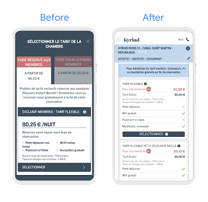
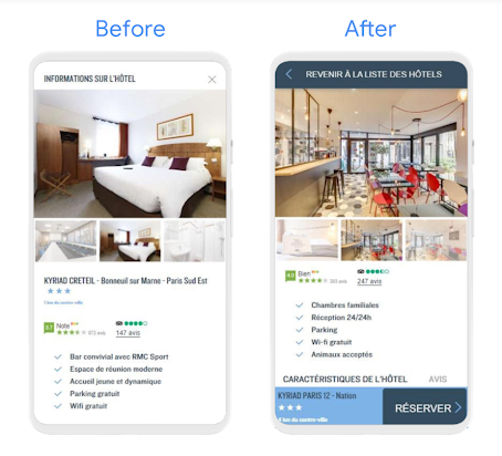
The Louvre Hotels Group joined our User Lab because it wanted to offer the best mobile experience to customers. More than 60% of web sessions to the hotel franchise came from mobile, so improvements were critical. In the workshop, users struggled to navigate away from the “Become a member” pop-up and felt pressured to enter their personal details to subscribe to the loyalty programme. Louvre Hotels Group responded to these privacy concerns by showcasing member benefits more prominently — for example, loyalty discounts — and added more obvious ‘back’ buttons to make it clear that membership was optional. These changes, along with a simplified navigation, helped the group improve its mobile conversion rate by 30% within a few months of making the updates.
“The user experience workshop helped us understand and resolve customer concerns,” said Thibaud Ciaravino, the lead product owner for web and app at Louvre Hotels Group. “We were able to give site visitors more control and make the whole experience more comfortable. And keeping customers comfortable is crucial at Louvre Hotels.”
How to benefit from user experience testing
We have hundreds of stories from our workshops, but there’s one theme that runs through them all — authenticity. We wouldn’t have gained these insights without talking to real users. Every business — big and small — should consider conducting regular user testing to uncover new opportunities and make improvements to promote growth. Here are key principles to make user testing work for you:
- Set clear, specific business goals: Are you aiming to improve a specific metric, or explain something in your data? Perhaps you’re interested in a particular audience segment, or want to ramp up your conversion rates. Having a specific challenge focuses the research and helps you prioritise different testing options to find the best solution.
- Involve all stakeholders: Brands often tell us the biggest blocker to implementing improvements is “organisational misalignment”. Clearly, bringing cross-functional teams together is key. Include people from product, tech, and marketing, as well as senior decision-makers.
- Ensure inclusive testing: Including different kinds of people in your testing is the right thing to do, and makes business sense. The more points of view you hear, the more opportunities you’ll find to improve your product. For instance, while conducting user testing with a large international retailer, a Black research participant told us the website did not feel like it was catering to her because no models on the homepage looked like her. Another participant revealed he was colourblind so he couldn’t read some important website information. Be sure you’re selecting a diverse group of testing individuals, even if it’s a small group. Select well. They’ll guide you to a deeper understanding of how to connect with a wider range of customers.


