Good ad experiences help the web thrive by funding the sites and services loved by millions, but bad ad experiences — like music blaring unexpectedly or having to wait 10 seconds before moving to the next page – can lead people to block all ads indiscriminately. Once that happens, every publisher on the web pays the price. So to get to the bottom of what makes an ad annoying, The Coalition for Better Ads conducted extensive consumer research.
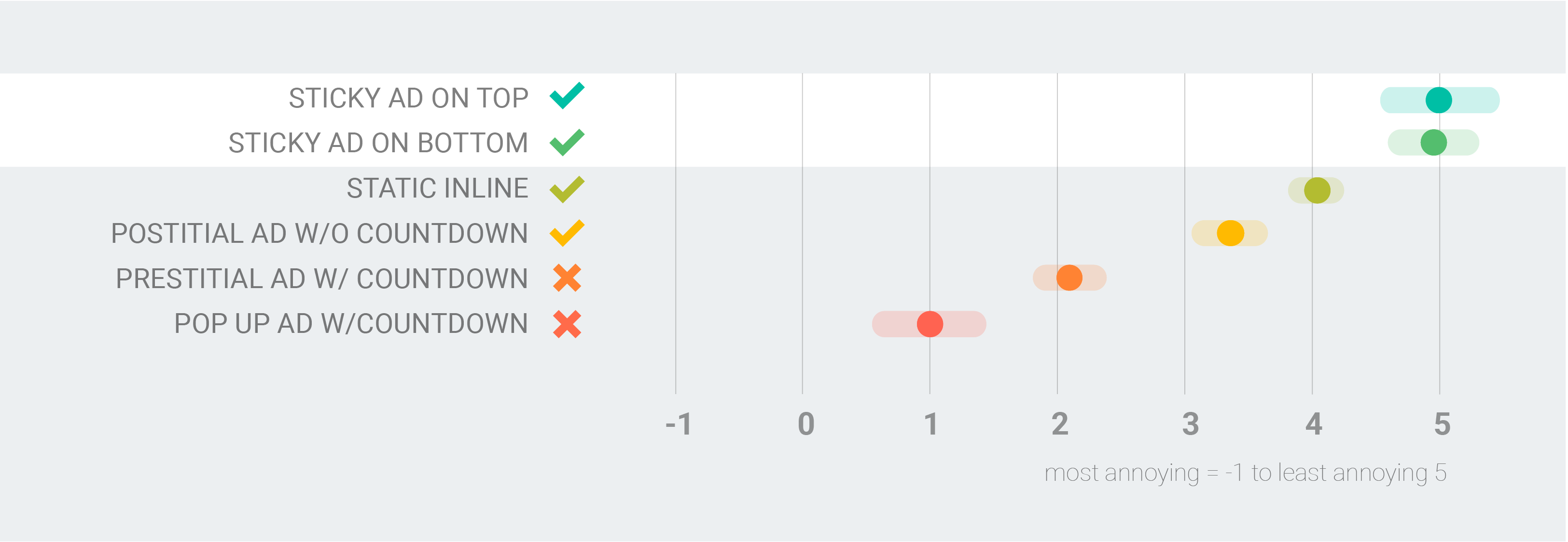
Thanks to the coalition's analysis, we now know which ad experiences people prefer the least. The good news is people don’t hate all ads, just annoying ones — so changing your ads from a more annoying experience to a more acceptable one can make a huge difference.
What kinds of ads annoy people the most?
Ads that interrupt. Imagine clicking a breaking news article only to be shown an ad that forces you to wait 10 seconds before you can read it. Consumers generally rank ads that disrupt the flow of information – particularly on mobile devices — as the most annoying. Research shows that 74% of mobile users find ads that interrupt access to content (like pop-ups) either extremely or very annoying, and 50% of users surveyed said they would not revisit or recommend a page that had a pop-up ad.1
Ads that distract. It only takes a few seconds for people to decide whether your site is worth their time. Flashing animations and ads that automatically play sound distract people during those critical first few seconds. These experiences are extremely disruptive in both desktop and mobile web environments, and can lead people to abandon your site.
Ads that clutter. When a page is bogged down with ads it takes longer to load, and this makes it harder for people to find what they're looking for. High-density ad displays on mobile devices create slower experiences than sites with less dense ads and similar creative assets.
69% of people surveyed said that they were motivated to install ad blockers by annoying or intrusive ads.2
What kinds of mobile ad experiences are better?
Mobile browsing is all about speed and convenience, so any experience that gets in the way or makes it harder to focus on the content in a small mobile window is likely to irritate mobile users.

Consider using simple full-screen inline ads instead of pop-up ads. They offer the same amount of screen real estate without covering up content.
Experiment with dismissible postitial ads. These allow users initial access to your content before seeing the ad, because making a person wait to access content — as in the case of a prestitial ad with countdown — creates a much more annoying experience.
Use these approaches sparingly and not on every page. The best experiences for consumers are ads that seamlessly exist with content, like small ads that stick to the top or bottom of the screen. A good example is the full-screen in-line ad (as seen below), which offers a large canvas without covering up content.

What kinds ad experiences do desktop users prefer?
On desktops, users like to maintain control over their experience, so any obstacle to controlling the flow of information at their own pace is unacceptable.

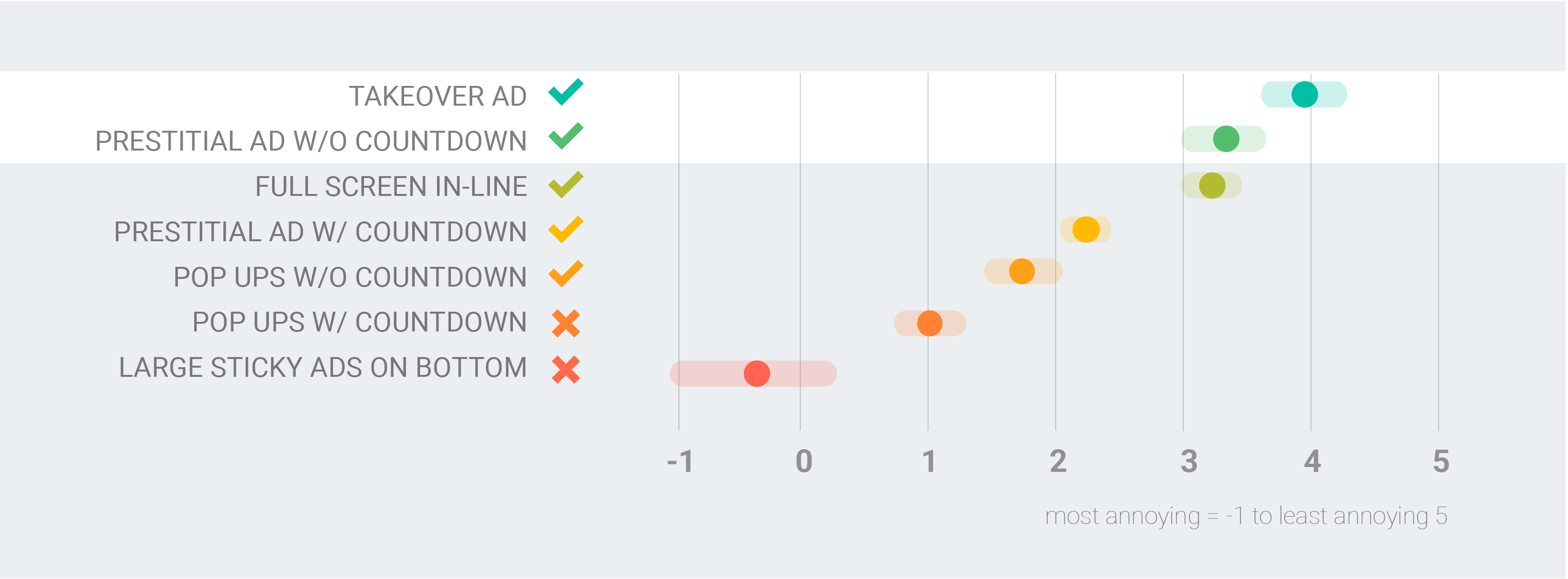
Takeover ads are a good alternative to pop-ups or prestitials with countdowns. These border the main content of the entire screen and offer advertisers a large canvas, seamlessly integrating with content without getting in the way.
Consider an easily dismissible prestitial without a countdown. These ads don’t hijack control from the audience, making them less disruptive.
Placement and layout also make a huge difference on desktop, where the larger screen real estate affects how people interact with content. For example, large sticky ads on the bottom are least preferred by consumers, so try a sticky ad on a side rail instead. Good alternatives include takeover ads (as seen below), which seamlessly integrate with content without getting in the way.

The golden rules of building better ad experiences
Building better ad experiences starts with understanding what users care about on your site, no matter how they access it. Don’t try to wrestle away the attention of your audience by obstructing their content — give them respectful ads that enhance their experience.
Be immediate. People are more likely to engage when ads load fast and don't slow down content. By applying the AMP framework to advertising, AMP ads offer a more efficient way to build, serve and measure responsive ads. With ads that loaded six times faster, Time Inc saw 13% greater viewability and an increase in eCPMs and click-through rate.
Be immersive. Ad experiences that seamlessly blend with a user's content experience are less likely to annoy them. Native advertising offers the opportunity to deliver ads that fit the form and function of your site's content. Responsive native ads can even scale across devices and screens. The New York Times saw a six-fold improvement in click-through rate and four-fold increase viewable impressions with native ads versus comparable standard banner ads.
Be relevant. Programmatic technology allows advertisers and publishers to deliver more relevant ads based on consumers’ interests, helping them stay more engaged on your site.
For the full rundown on annoying ad experiences, read the Coalition’s research here.


