Many businesses use data to support their decisions instead of drive their actions. But why? After all, data is really only valuable if you can translate it into actionable insights. Gaining these insights starts with figuring out what you want from your data — finding its value. Here we talk about the questions you should ask regarding the context, need, vision and outcome of your data, and we offer a helpful framework for turning that data into meaningful stories and business successes.
In 1910, Scottish writer and poet Andrew Lang said, "He uses statistics as a drunken man uses lampposts — for support rather than illumination." Decades later, many modern businesses still do just that, using data to support rather than drive their decisions.
Why? After all, data really is valuable only if it helps a company make better decisions. Your organisation might be sitting on the world's largest data pile, but it's useless unless you have the means to translate it into insights that drive your business.
With that in mind, here are some important steps you can take to help mould your data into actionable insights.
Defining the data
Gaining successful insights means figuring out what you want from your data — finding its value. Consider what you want to do with the actual data. In Thinking with Data, Max Shron offers a helpful framework for narrowing the scope of a project such as data analysis. Similar to a story, a project will always include exposition (the context), some conflict (the need), a resolution (the vision) and, hopefully, a happily-ever-after ending (the outcome).
Answering the following questions will help illuminate the best plan for using your data.
- Context: What are you trying to achieve? Who is invested in the project's results? Are there any larger goals or deadlines that can help prioritise the project?
- Need: What specific needs could be addressed by intelligently using data? What will this project accomplish that was impossible before?
- Vision: What will meeting the need with data look like? Is it possible to mock up the final result? What is the logic behind the solution?
- Outcome: How and by whom will the result be used and integrated into the company? How will the success of the project be measured?
Building the framework
I previously wrote an article about telling meaningful stories with data, but how do you go about finding the right story to tell? Architects are a good source of inspiration. In the same way that they must turn abstract design requests into reality, so must marketers transform data needs into actionable insights.
Understanding and visualising data is similar to the way an architect sketches in the concept stage. Creating multiple charts, graphs and tables is like having a conversation with data; it helps us get acquainted with the figures to find interesting insights.
In a fascinating New York Times article, Michael Graves, emeritus professor of architecture at Princeton, rebuffs the idea that technology has caused "the death of drawing" in architecture. He goes on to discuss how drawing is as much a process as it is an end product, and that while computers have their place, so does the human/emotional element. He deconstructs architectural drawing into three types: the "referential sketch", the "preparatory study" and the "definitive drawing". Interestingly, his points about each relate to the ways successful marketers approach data.
Below I apply Graves' thoughts on architectural drawing to the process of making data actionable:
1. Sketch: Find your inspiration
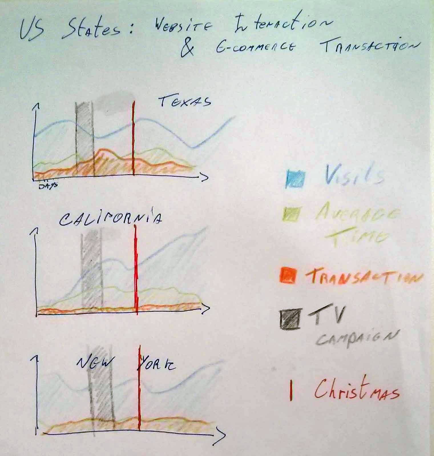
Start the initial data conversation conceptually, using pen and paper to sketch. Jot down design concepts or overall ideas about your desired outcome. For example, while creating a series of charts for a previous article, I drew the sketch below, which drove the design and structure of the final work.

2. Prepare: Do your data homework
This step may start with pen and paper, but will likely evolve as you dig into the data in your analysis and visualisation software. Use the following to brainstorm ideas about how you'll approach the data:
- Filtering: Cut the noise and focus on the most interesting topic.
- Sorting: Rank data by importance.
- Grouping and segmentation: Summarise data and segment different groups.
- Visualising: Bring data to life using intuitive visuals.
Architects prep similarly, going back and forth from 2D sketches to 3D plans; although a sketch might be appropriate and valid in itself, it comes to life only in the actual terrain. In the data world, the same happens when crunching numbers. Sometimes it's too imprecise, formatted incorrectly or incomplete. This is where the importance of constantly validating your "homework" with actual data comes in to play.
3. Visualise: Bring data to life
Visualisation can help during the metamorphosis of data into actionable information. "Numerical quantities focus on expected values, graphical summaries on unexpected values," said mathematician John Tukey. He was on to something — the real power of visualisation lies in its ability to display unexpected findings in a clear, easy-to-grasp manner. To help bring life to your data, there are several analysis and visualisation tools available, such as Google Analytics.
The following principles will help guide the kind of visualisation that evokes compelling insights:
- Be aesthetically mindful: People are naturally attracted to beauty, so why not make a chart as pretty as possible? Aesthetics can also help make the charts easier to comprehend — pinpointing the resulting action. For further insights into importance of such aesthetics, read Stephen Few's Now You See It, Simple Visualization Techniques for Quantitative Analysis.
- Focus on trends, not data points: The best insights often come from looking not at singular data points but at trends, especially when they change direction.
- Compare time ranges: Examine different time ranges, such as week over week, month over month or summer over summer. Be careful to use comparable ranges, though; comparing March with February might pose problems as the number of days is different.
- Search for strong relationships: Often, the most powerful and insightful discoveries in data analysis are the relationships between variables, or correlation and dependence to statisticians.
- Try different perspectives: Because one individual can't see everything, invite others to delve into the data. It's vital to have several pairs of eyes looking for actionable insights.
- Be sceptical: Always analyse data from at least two angles. For example, plot the same data multiple times using different chart types. Data has the power to mislead, so make sure that it's telling the story accurately.
Unearthing gems in data can take a little work, but it provides a helpful dose of visualisation. As only a sample of some of the best visualisation techniques, the above list is far from complete. Take the time to find your own best mix.
From data to action
I hope the framework and principles discussed here will help you reveal insights in your data, inspiring you to build on the most relevant narrative uncovered in that data to help propel your business. No single set of principles will work for every context, so it's up to you to pinpoint the best techniques to construct your data analysis.
Turning data into actionable insights can be an unstructured process. Fortunately, there are several techniques to help professionals go from data needs to actionable insights. Marketers need to establish guidelines, similar to an architect's blueprint, for working with data effectively — but there's no reason it can't be approached creatively.


