Digital marketers spend a lot of their time doing quantitative analysis – looking at things like bounce rates, time spent on site, and so on. And while all this is interesting, of course, sometimes it can feel like there’s too much user data, and not enough customer insight.
The hard truth
So, why don’t marketers make up for a lack in qualitative insights by doing more usability testing? It might be because sometimes it’s just too painful hearing what people think about that website navigation you spent days (okay, months) working on.
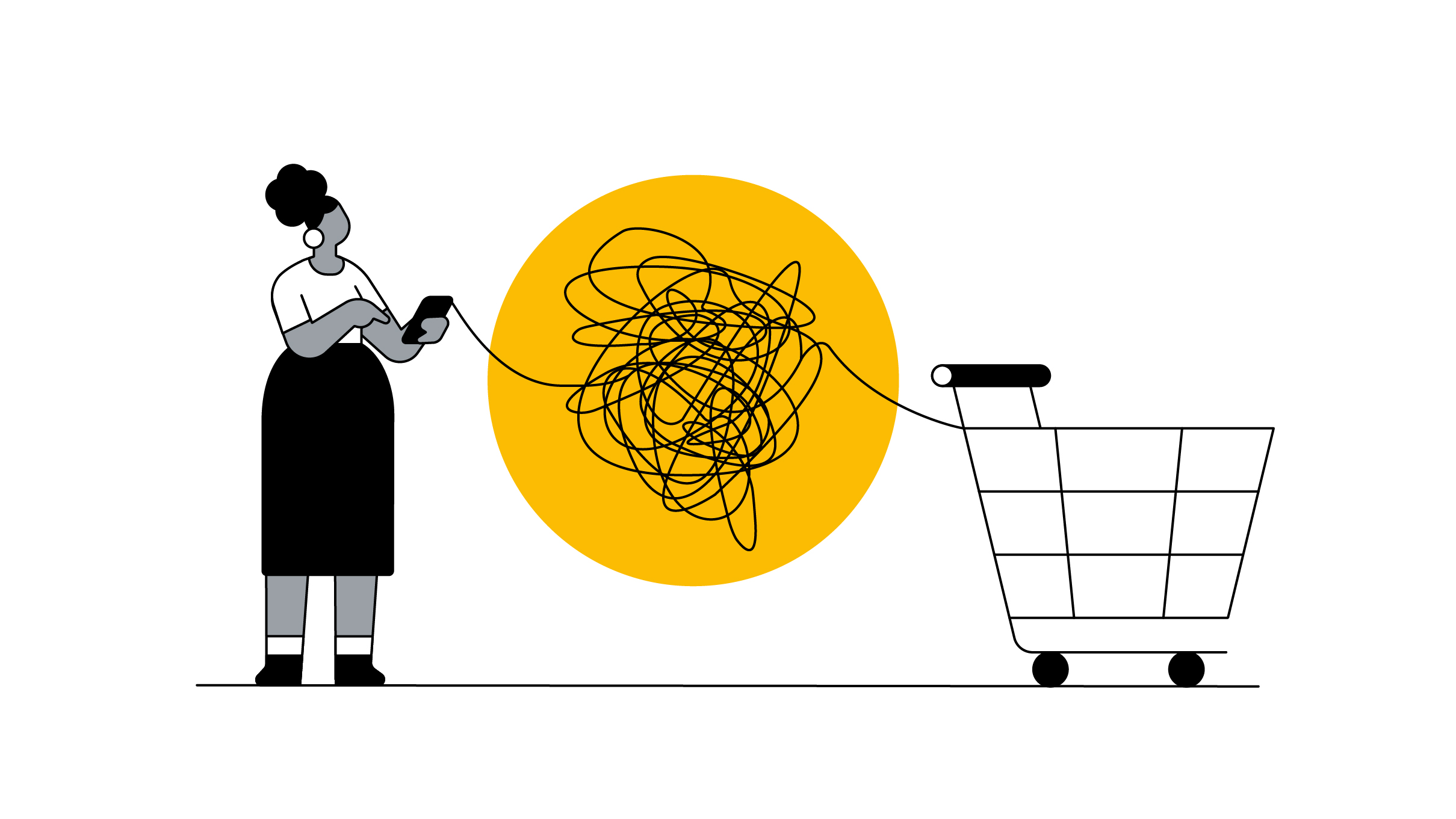
Painful, but valuable. Because by running usability tests, you’ll be reminded that people rarely act and think in just one way. There are distinct patterns, of course, but never just one journey to the checkout.
Watch these videos showing two people using the same site, and you’ll see what I mean.
User 1:
User 2:
As different people interact with sites in different ways, it’s not possible to design with just one single person in mind.
Instead, you have to categorise users according to behaviour types. Then you can use those behaviour traits to inform your design and make it work for your target audience.
What shoppers want
One possible solution for discovering behaviour types is to use a framework, like the one Bryan and Jeffrey Eisenberg described in the book Waiting for Your Cat to Bark?: Persuading Customers When They Ignore Marketing.
Before we look at this framework, it’s important to bear in mind that individuals are not just ‘one type’. They shift according to different contexts and mindsets. Yet by designing for all four types, we can cover the basic patterns.
Behaviour type 1 – The competitive: Logical and fast-paced (as seen in the first video above)
- Wants to understand things fast, with facts
- Scans headers, bullet lists, icons, and reads only a few words
- Soon gets frustrated by bugs or lack of clarity
Be sure to include: a search function so they can go straight to what they’re looking for. Also, clearly signpost your top categories and key benefits, as they won’t spend much time reading through your site. Lastly, add your value proposition (eg. “free shipping & express delivery”) to the top of each page in the funnel to constantly remind users why they should buy from you.
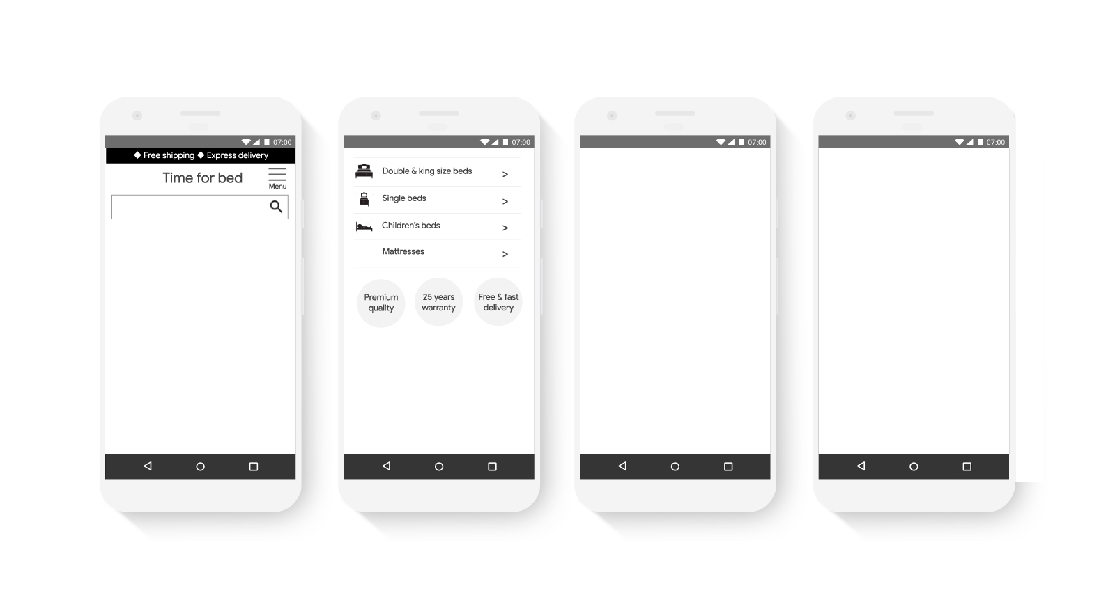
Behaviour type 2 – The methodical: Logical and slow-paced (as seen in the second video above)
- Wants to make an informed choice, using research
- Scrolls through the whole page and even reads long paragraphs in small font sizes
- Wants to evaluate and compare
- Trusts experts, reviews, and articles.
- Won’t be rushed, so be careful using countdowns and contests.
Be sure to include: lots of facts and figures, and a very clear and well-laid out comparison table. Use plenty of ‘read more’ links too, where people can access ‘expert guides’ or similar. Finally, include a comprehensive FAQs page where shoppers can delve into the detail.
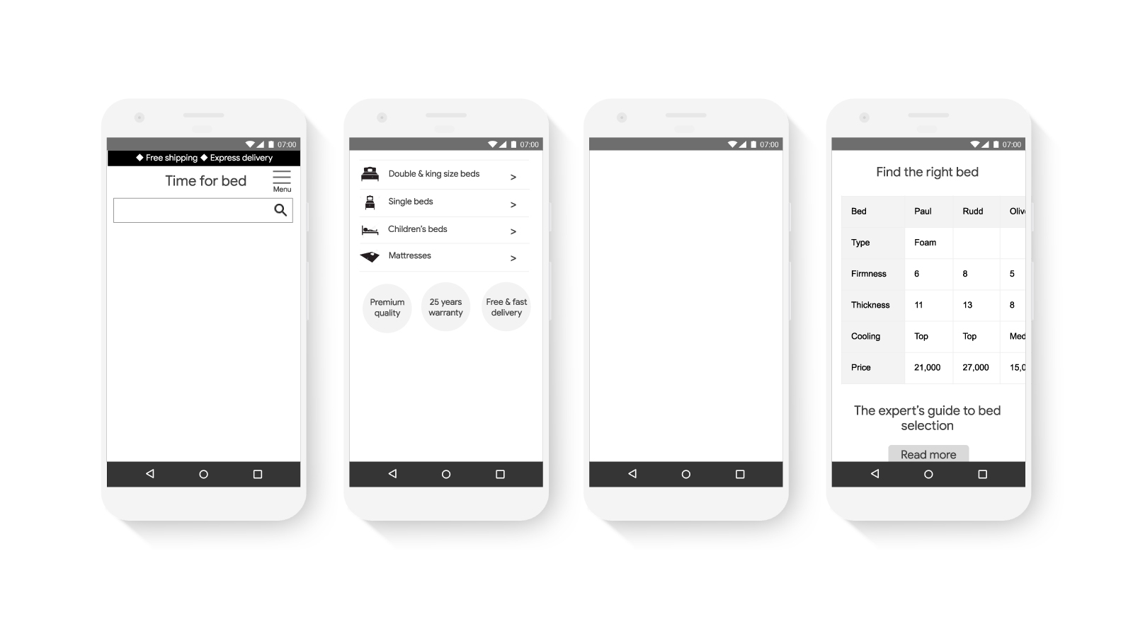
Behaviour type 3 – The spontaneous: Emotional and fast-paced
- Decisions are influenced by feelings
- Follows brands and trends to create a lifestyle
- Prefers images to small text or long paragraphs
- Responds well to persuasion techniques. Eg. countdowns and influencers
- Uses shortcuts to understand the world. Eg. high price equals high quality
- Impatient and easily distracted during the purchase process
Be sure to include: lifestyle-focused imagery, with a strong up-front offer that appeals to their spontaneous nature. Also, add a ‘most popular’ section, as they won’t have the patience to read lots of reviews and make comparisons. Try to add some influencer-related content too, as this will resonate heavily with their lifestyle goals.
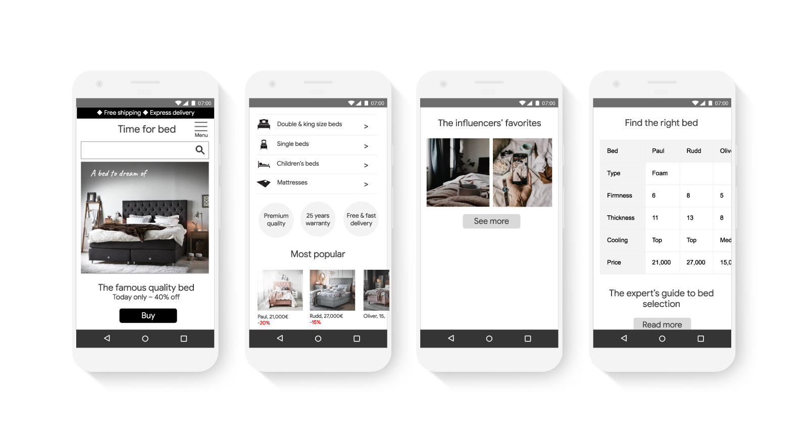
Behaviour type 4 – The humanistic: Emotional and slow-paced
- Influenced by creativity, storytelling, social belonging
- Trusts the opinions of friends and user reviews
- Enjoys images, especially if they show people’s emotions
- Loyal to sales people and brand interactions they like
Be sure to include: just like behaviour type 3, these users will be drawn to aspirational lifestyle imagery and influencer-style content. Customer quotes are also a powerful tool here, especially where past users talk passionately about their experience, rather than just scoring it out of ten.
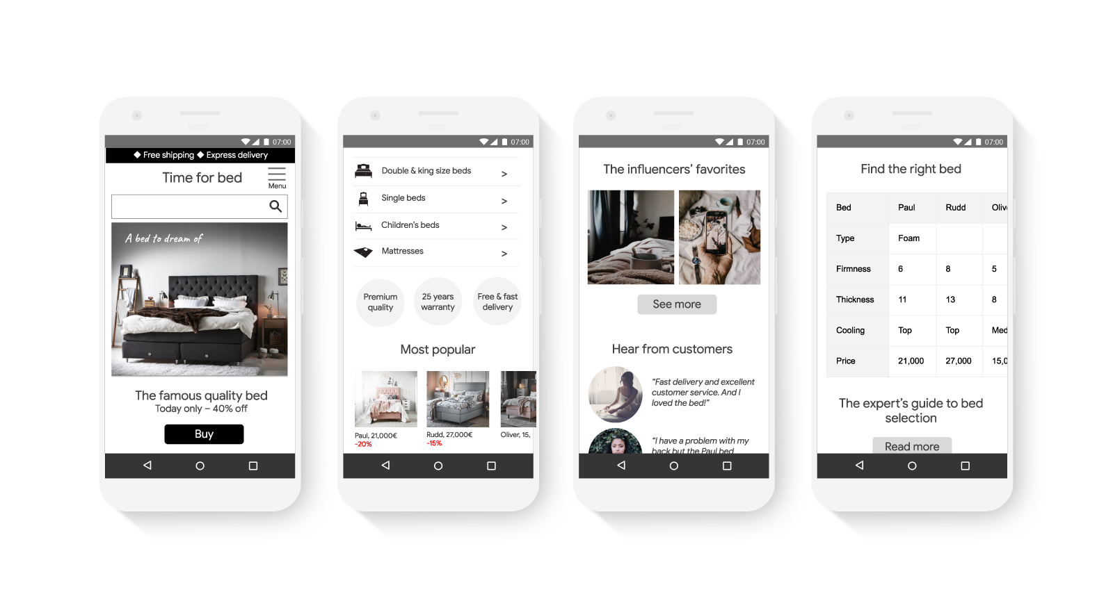
The perfect mix
Hopefully, by combining both your quantitative and qualitative research; running usability tests (ideally do at least five per month); and designing for different behaviour types, your customer data won’t feel quite so anonymous anymore.
Then you’ll be better placed to focus not on what you’d like to say, but what your users actually need and want. And that way, there’s more chance they’ll choose you.
To access more research and best practices around how to win on mobile, take a look at this Win on Mobile course.
