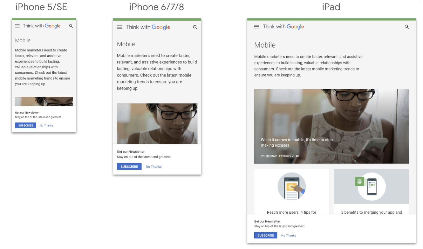
Discover how Device Mode lets you view and interact with your website’s UX through the eyes of its mobile users – so you can quickly and easily test how it looks, works and responds in the wild.
As a marketer, business owner or optimiser, it’s easy to fall into the trap of only viewing your website on your office laptop or large-screen desktop. However, it’s worth bearing in mind that a big chunk of users interact with your site on smartphones and tablets – while they’re commuting, waiting for the kettle to boil, or watching TV.
In fact, around half of all website traffic is now mobile1. And, in Western Europe, almost 40% of transactions now occur on portable devices2.
Chances are, the way you view and test your site right now probably doesn’t accurately reflect the real world. Yet checking how your site looks and feels on multiple mobile devices just isn’t practical.
What’s the solution?
Try Device mode
One approach is to use Device mode on your Chrome browser. That way, you can view and use your website through whichever mobile screen you like. You can even match it to the exact devices your customers use (you’ll find these under Audiences/Mobile/Devices in Google Analytics).
Device mode also lets you rotate to landscape view, plus you can add the device’s frame for a close approximation of how your site appears to each user. You can even simulate fast or slow networks and apply extra strain on the device’s CPU to test how this affects load times.
After all, just a one second delay in mobile loads times can impact mobile conversions by up to 20%3.
How to launch Device mode
Step 1:
Open your website in Chrome.
Step 2:
Right click anywhere on the screen and choose ‘Inspect’ from the menu.
Step 3:
Toggle the devices icon.
Step 4:
Click ‘Responsive’ on the menu bar, and select the device you’re optimising for. Alternatively, drag the handles to set a custom screen size.
What you can do in Device mode
After entering Device mode, you’ll be able to check how your site looks and works on different devices. For example, you might notice certain pages have too many words on them, or your headlines are too long, or that folks have to zoom and pinch to read buttons.
Look to see if your most important content and CTAs are ‘above the fold’ too – in other words, whether users have to scroll down to find the good stuff or make a purchase. If they do, consider moving things up a little.

Time well spent
Seeing how your website looks and feels in the real world – and making subsequent improvements – will be worthwhile. For example, in the US alone, 79% of people say they’re more likely to revisit and/or share a mobile site if it is easy to use4.
And more than 90% of B2B buyers reporting a superior mobile experience say they’re likely to buy again from the same vendor, compared with only about 50% of those reporting a poor mobile experience5.
Be sure to view your site this way after every redesign or minor change you make. It’s also worth checking-in after major new mobile devices are launched, just to make sure you’re staying up-to-date.


