Shoppers love browsing on their mobiles, but when it comes to buying, desktop very often still wins out. Explore the reasons why, and discover some quick mobile site improvements that will get your visitors in the spending mood.
Consumers are in full-on seasonal shopping mode right now, and mobiles are making it easier than ever to find what they need. Mobile searches in Northern Europe for “where to buy” have increased 51% since 20161 – especially as people get used to the ease and convenience their devices give them.
In fact, two thirds (62%) of US consumers now expect brands to deliver a consistent experience, every single time.2 So much so, that many mobile users no longer want to ‘save for later’ like they used to. They want to act, and buy, right now.
Yet, despite all this, mobile platforms still don’t tend to deliver great results when it comes to conversion rates. Typically, mobile conversion rates are 40% below those of desktops3 – and 63% of app users don’t return to an app within a month of downloading it.4
What’s going on? A big part of the challenge is that most mobile sites don’t yet make it very easy for users.
Before we look at that though, let’s back up a bit and consider people’s mindsets, particularly when they’re using mobile sites this time of year. Research shows that over half of them describe holidays as “frantic”, and 61% as “stressful”5 – not emotions any brand wants to be associated with.
Given those insights, it’s may be no surprise that mobile shoppers are kind of demanding. What are mobile sites doing wrong in the users’ eyes, exactly?
Very often, they’re simply too slow. Given that 53% of users leave mobile sites that take over 3 seconds to load,6 that’s a huge number of missed opportunities. Other times, scrolling isn’t responsive, or content bounces around while images drop in. And of course, flaky connections bring all kinds of problems – as does the eye-rolling pinch and zoom form fill.
With peak shopping seasons just around the corner, the last thing any online business can think about right now is making any big changes to their sites. However appealing the potential benefits, implementing lofty website changes will take time and money, and no one can afford seasonal downtime.
With that in mind, here are some quick and easy things you can do to improve your mobile site, starting today.
1. Check the basics. Can people find what they need?
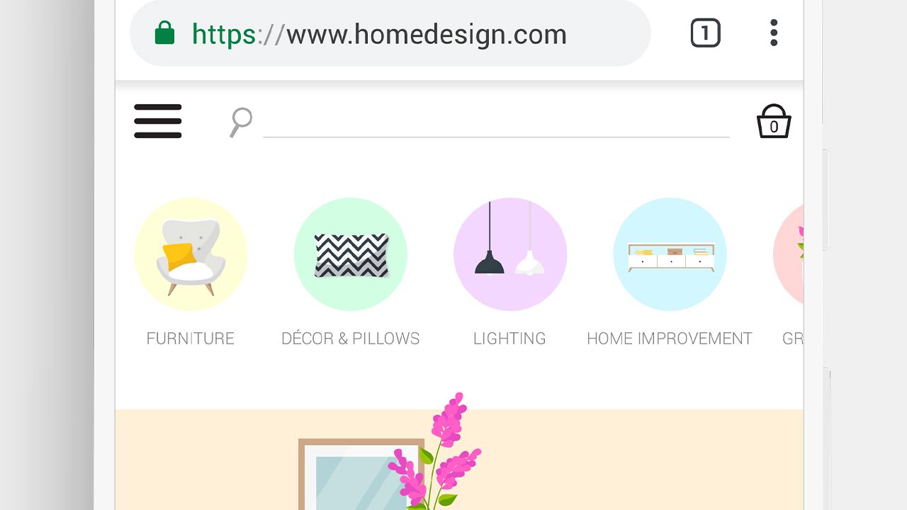
Give shoppers what they came for, by making sure your top products and categories sit above the fold – with clear calls to action. Zara, Made.com and Wayfair are all examples of best practice here.

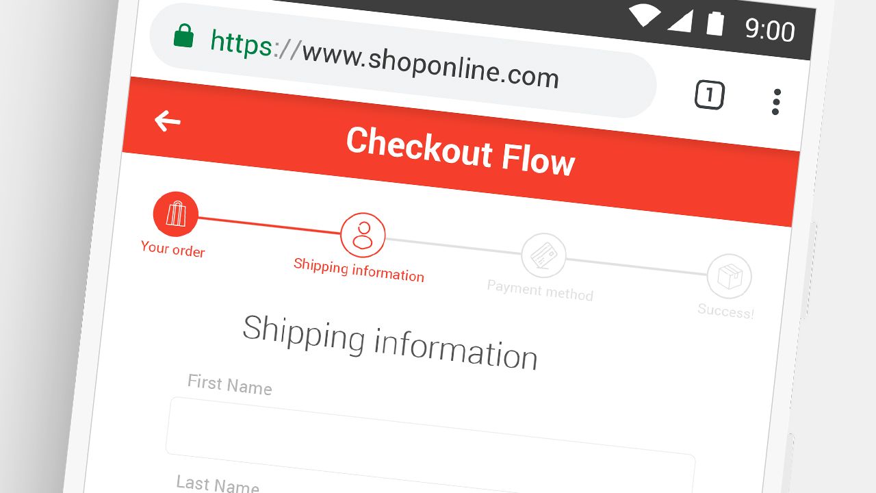
2. Test your own contact form and checkout.
A shopper’s-eye-view of your mobile site will soon reveal any bugs or issues that can be easily fixed. Remember to keep reminding shoppers of the great deal and total savings they’re getting – even during checkout. If people start to waver, they’ll swipe back or go elsewhere.

3. Gain some quick speed wins, with Lighthouse
Lighthouse is a free Google Chrome extension that helps you spot all those usual suspects that slow websites down, such as large images or how your page code loads. Use it to get a list of easy fixes and quick speed wins.
When the season’s over, you’ll hopefully have time to explore any bigger improvements ready for next time. For example, adding Google Pay as a checkout option, or trying Accelerated Mobile Pages (AMPs) so content loads faster. You could even look into Progressive Web Apps (PWAs), to give your site a smooth app-like feel that’s even easier for people to use and buy from.
For now though, keep your eyes on the prize and only make quick changes that will bring tangible improvements. And whatever you do, remember that 1 in 5 adults will shop online on December 25th – so keep going ‘til the party’s over.


