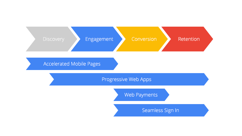
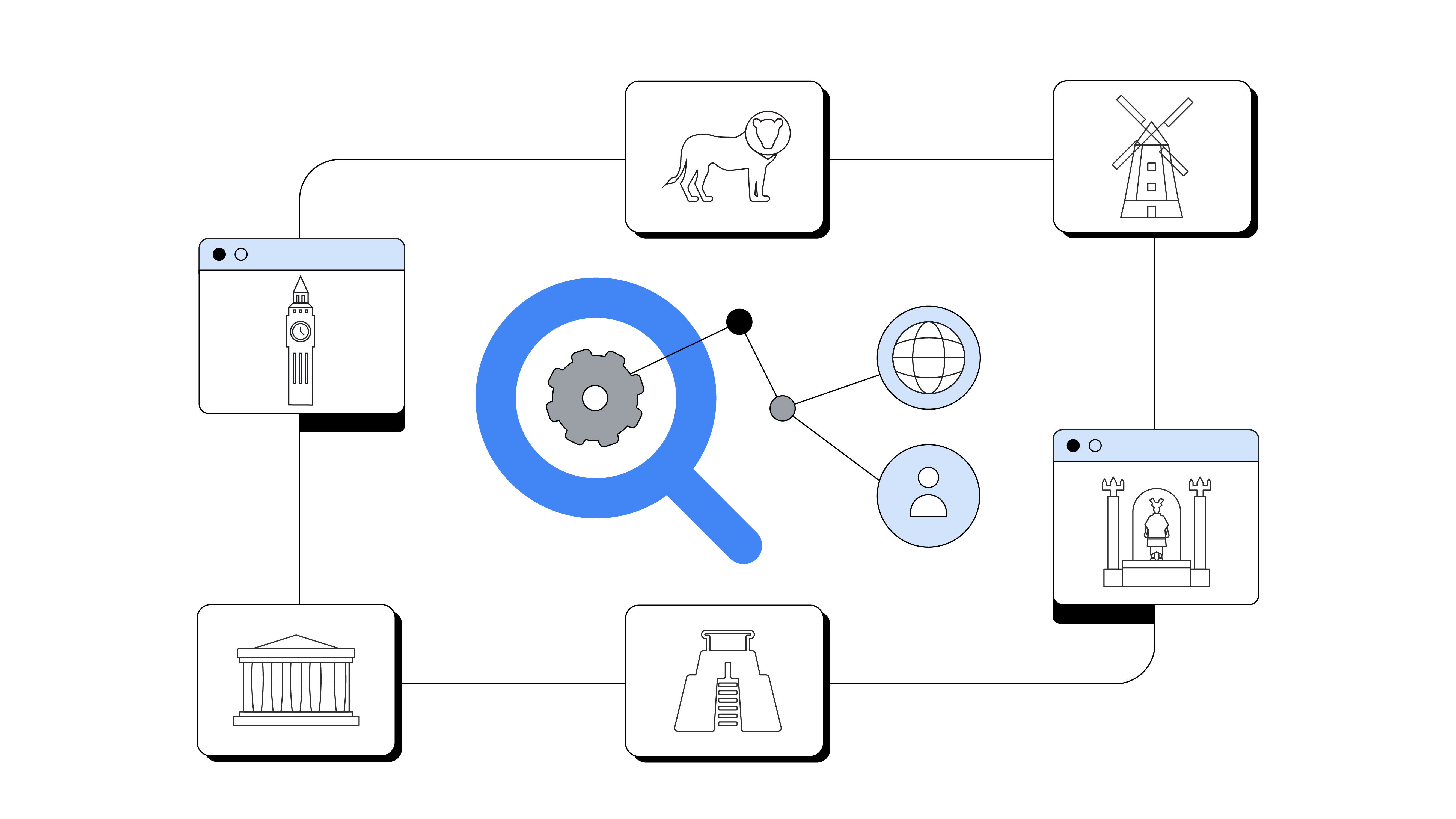
Not long ago, having a website optimized for mobile devices was considered the pinnacle of success. But there’s still much to do to make users’ mobile experience great. User expectations have developed much faster than the technological advancements on most mobile sites. What’s next? Where’s it all heading? Innovation in this space today aims to improve mobile through the entire user journey from discovery to retention.

Accelerated Mobile Pages
Accelerated Mobile Pages are a set of standards that aim to improve discovery on mobile by creating optimized pages that load content quickly, even under difficult network environments. It’s no secret that users expect a fast experience on mobile. One recent research study showed that as page load time goes from one second to seven seconds, the probability of a mobile site visitor bouncing increases by 113%.1
AMP enables everyone to have a site that loads super-fast as it’s built with three main components:
- AMP html (Normal html with a couple of restrictions and a few extras)
- The AMP JS library (This ensures the fast rendering of AMP html pages by adding and validating a few important rules in your mark-up)
- The Google AMP cache (A proxy-based content delivery network that can be used to fetch, cache and serve AMP html pages)
AMP controls the entire load chain and prioritizes certain elements and requests over others. Most third-party content and elements below the fold are loaded after the main content arrives. As AMP puts some limitation on scripts that you can run on the page, most of the time AMP is used to transform static content, such as landing pages.
The median load time of an AMP page is 0.7 seconds.2 On average, by converting a mobile page to an AMP page you can decrease its load time fourfold and decrease the amount of data sent over the internet network 10 times!
Progressive Web Apps
With AMP, discovery on the mobile web it is getting even easier. What about engagement? Up until recently, marketers creating assets for mobile needed to choose between having a mobile website offering optimum reach and native apps offering higher engagement.
In general, engagement is much higher in the app environment than in mobile web. A native app offers more tools to engage the user, the ability to function without internet access, a higher frequency of visits and so on. But one study showed that an app loses 20% of its users on average for every step between the user’s first contact with the app and the user starting to use the app.3 Typically, a user must first find the app in an app store or via an ad, download it, install it and then – finally – open it.
Progressive Web Apps allow for an app-like user experience on a mobile browser. Users can interact with mobile web pages that look, feel and function like an app. This includes push notifications, offline accessibility and a homescreen icon.
One of main the main components of a Progressive Web App is a service worker. This is script written in JavaScript that acts like a client-side proxy. With a service worker you can pre-cache key resources of a website so it will load instantly, regardless of internet network state and speed. You can put content in the cache that’s similar for a wide set of pages and only dial in content from the web server if it’s needed for a particular page. In this way you can bring content closer to the user, decrease load times and increase stability, even under poor network conditions.
Flipkart, India’s largest ecommerce site, decided to combine their web presence and native app into a Progressive Web App. These measures drove impressive business results. Compared to the previous mobile experience, Flipkart’s Progressive Web App:
- Improved users’ time on site from 70 seconds to 3 minutes 60 seconds
- Produced a 40% higher re-engagement rate
- Generated a 70% greater conversion rate among those arriving via the “add to homescreen” button
- Reduced data usage threefold

Web Payments API
One of reasons why conversion rates are lower on mobile than on desktop is the difficulty of filling out forms on mobile. This means many online purchase forms are difficult to use, slow to load and refresh, and require multiple steps to complete.
These challenges especially apply to payment forms. Marketers struggle to create purchase flows that support multiple unique payment methods. Even small differences in payment method requirements can make form completion and submission quite challenging.
The Payment Request API is a system that was created to eliminate typing as much as possible so the checkout flow is smooth and hassle-free. This isn’t a new payment method, nor does it mean direct integration with payment processors. Instead, it’s an open and cross-browser standard that replaces traditional checkout flows by allowing merchants to request and accept any payment in a single API call.
The process begins when the site owner passes to the browser all the information required to make the purchase: the amount to be charged, what currency they expect payment in and what payment methods are accepted by the site. The browser checks compatibility between payment methods that are accepted by the website and the types of payments the user has installed on his or her device. The browser then shows the compatible payments to the user. After that, the user selects a payment method and authorizes the transaction (for example, using a credit card that’s already stored by the browser). Once the user authorizes the transaction, all the necessary payment details are sent directly back to the website. Payment requests can also be extended to return additional information, such as shipping address, payer email and so forth. This allows the website owner to get all the information he or she needs to finalize a payment without ever showing the user a checkout form.
Credential Management API
We’ve covered discovery, engagement and retention – so that brings us to retention. To help users enjoy seamless sign-in, across devices, the Credential Management API is a standards-based browser API that allows for communication between the site and the browser.
The Credential Management API:
- Can store user credentials once registered for further use, such as a username and password combination or even federated account details.
- Allows a person to tap sign-in via an account chooser, where the user just selects an account from their stored accounts to use when signing in.
- Makes sign-in flows simple. Users can automatically sign back into a site, even if their session has expired.
All technologies together
All of these technologies can be combined together to guide the user through a seamless overall journey. Let’s imagine what a modern website might look like built with all of them. I live in Grodzisk Mazowiecki. I commute to work in Warsaw every day. I decide to use my commuting time to buy a gift for my wife. I search for nice book for her. The search results take me to a website. As it’s an AMP page, it loads really fast – much faster than usual. Scrolling through different pages is quick and seamless. I decide to choose one of the products. Unfortunately though, the item is out of stock.
The page tells me I can get a notification when the book is available again. I’d love to get that info from the website rather than having to check other websites, so I’ll allow the page to send me notifications. During my trip from Grodzisk Mazowiecki to Warsaw, there are a few places where the internet connection very weak, and sometime it dies out altogether. At one specific moment I lose access to the internet. But event though I’ve lost service, I don’t even notice.
Everything loads super smoothly as I go from item to item, navigating back and forth throughout the website. While I was connected to internet earlier, the site – which was created as a Progressive Web App – fetched all the resources and pages and cached them offline. That’s why it feels like I’m still online, even though I’ve lost access to the internet. On the website I can’t find anything I really like, with the exception of the book that’s temporarily not available. I don’t have time to search more as I’ve arrived at my town. Later that night, I get a push notification from Chrome telling me that the book I was looking for is now back in stock.
It’s great news as in the meantime I’d forgotten all about my earlier research. I tap on the notification and am taken straight to the item page. I add it to my cart and get ready to check out. I tap “checkout” and am ready to place an order. Since I created an account on the website in the past, I am signed in automatically via Credential Manager. When I get ready to pay, I notice that my payment credentials have already been pulled up in the Web Payment interface. With a single additional tap, I place my order. At the last stage I’m taken to the order confirmation page, I notice a prompt from Chrome to add that page to my homescreen. I’ve been on the site long enough for the browser to know that I might want to visit it again. When I click “add,” an icon is added to my homescreen. A few days later, I’m bored again on my train ride home. I decide to tap on the icon and get taken to the page. I can browse and explore more books despite not being connected to data.


