Our daily lives revolve around mobile — whether it’s making calls, clicking the buy button, or managing our money. In Europe, the Middle East, and Africa (EMEA) the average daily hours spent in apps has grown by 30% since 2019. So it’s never been more important for brands to offer a seamless user experience (UX). And even small changes can drive great results.
AirSlate, Inc., a global technology company, which serves over 100 million+ users worldwide across its portfolio of no-code workflow automation and document management solutions, had a big opportunity to make improvements to its mobile experience.
The company has a range of products, such as airSlate, a document workflow automation app, pdfFiller, a PDF management app, and signNow, an e-signature app. While they already had a wide base of app users engaging with their products, they wanted to grow a more loyal audience. The team optimised the brand’s in-app experience, grew the app user base, and increased in-app conversions by shifting to a test and learn approach.
A/B testing is as easy as 1,2,3
A/B testing is a great way to uncover new opportunities and make improvements that promote growth. And, it’s actually the only way to know whether you’re making the user’s experience better or not.
This mindset is core to airSlate, Inc. The company began testing across all its apps two years ago and has since established the philosophy: “Start every day knowing nothing and testing everything.”
Many brands tend to focus on full redesigns or new features, rather than continuous optimisation. “This is something companies struggle with,” says Taras Sukhenko, senior project manager for pdfFiller mobile apps at airSlate, Inc. “But we believe that small changes lead to big impact. That’s why we’ve adopted an evolutionary redesign approach, rather than a revolutionary one.”
Ways to improve mobile user experience
The team had a list of specific hypotheses they formed based on user research, industry best practices and data from analytics. These included things such as whether native or web checkout would perform better, and whether adding a screen to showcase free trials would entice users to subscribe. So they tested them for two months from August to September of 2021 to find out whether their assumptions would prove correct. The areas they tested were: in-app navigation, login screens, social login, payment and onboarding screens and subscription prompts.
Here’s what they found:
Navigation
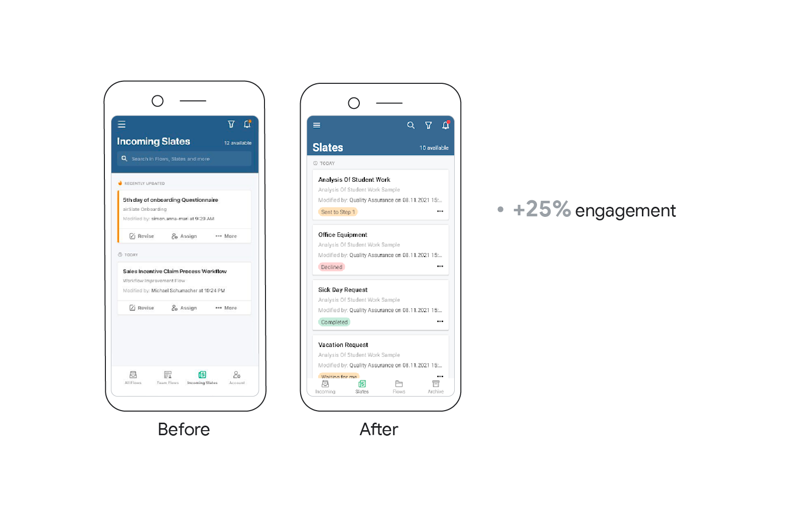
Users were struggling to navigate between slates — the name for a collection of forms and documents. To improve UX, and increase the number of slates users create, airSlate team:
- Added colourful and informative statuses to help users prioritise actions
- Moved each slate menu to the ‘three dots’ icon — easing navigation and making the overall design cleaner
- Replaced the search bar with an icon in the top right corner to optimise space
As a result, slate creation shot up by more than 25%.
Forms
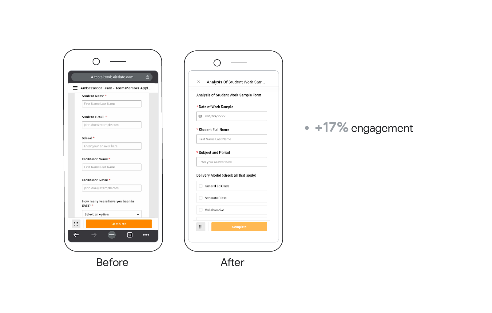
Completing forms on mobile was always a challenge for users due to constraints like unreliable connectivity, data input fatigue and limited screen real estate, among many others. So airSlate tested different approaches to improve this, and changed:
- The webview format into native app format for filling out forms, because of its ability to run smoother and its overall better user experience
- The card view mode into listview to make the filling session simpler and to decrease time spent completing the form
As a result, the fill success rate in forms increased by more than 17%.
Registration
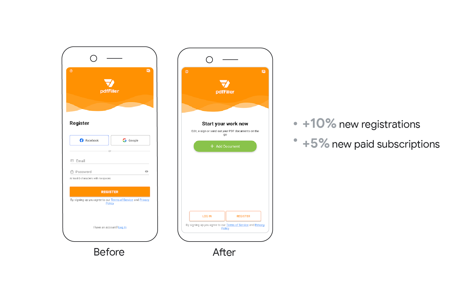
To improve key metrics, the team implemented a ‘guest mode’ — giving users the chance to upload documents from the start screen without registering. This allowed people to test the product before having to go through the signup process. By launching this new feature, registrations increased by 10% and new paid subscriptions rose by more than 5%.
Social network authorisation
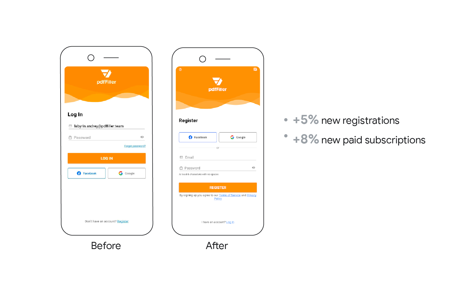
The team also changed the positioning of buttons to make design more intuitive, which helped increase registration and subscription rates. Registrations rose by 5%, and new paid subscriptions increased by 8%.
App payment screens
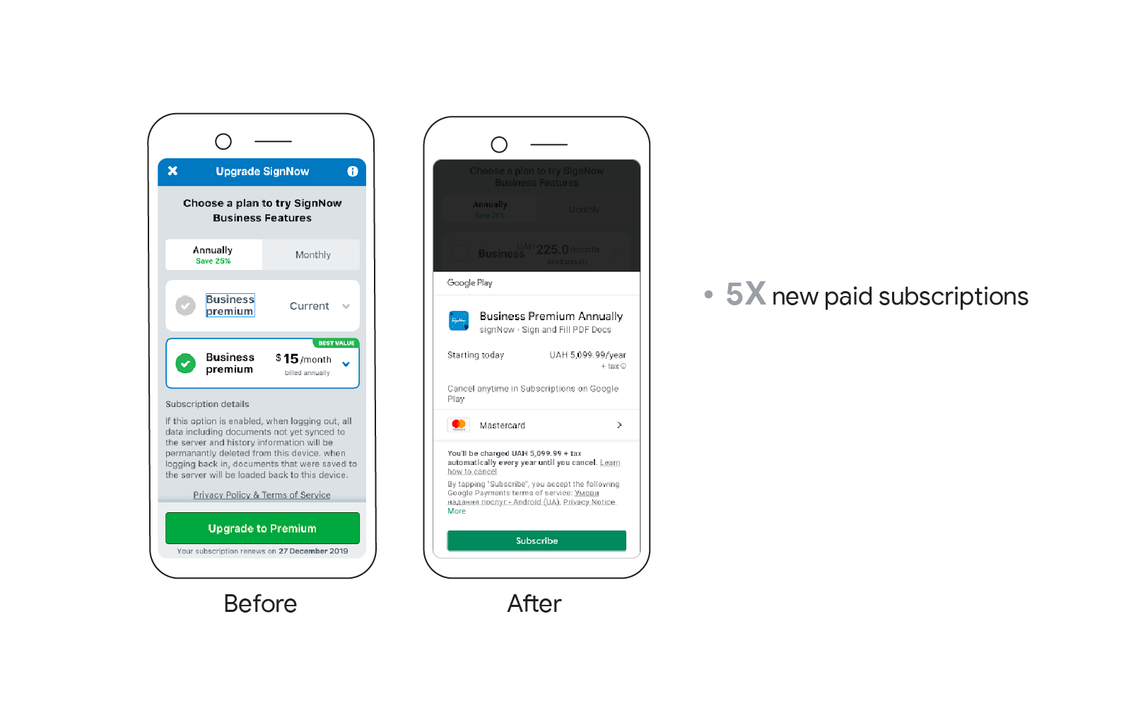
The team at signNow was looking to increase their subscribers, while gaining a better understanding of whether native app or web checkout would perform better. They noticed web checkout wasn’t very intuitive and the payment process had too many stages, meaning it was easy to lose users. The teams decided to switch from web checkout to a native two-click payment with Google Pay. As a result, they increased new paid subscriptions by 5X.
Onboarding screens
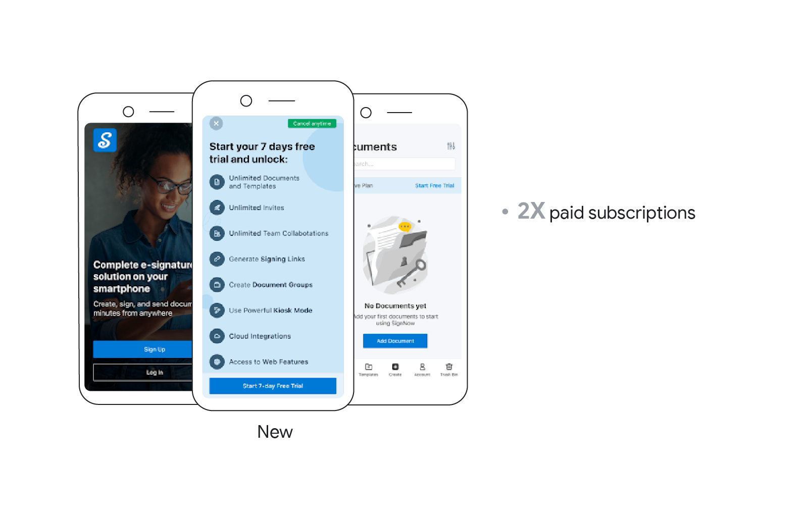
By adding a new screen when users register, signNow was able to showcase benefits of the free trial and motivate new users to subscribe. As a result, new paid subscriptions increased by 2X.
User experience learnings for marketers
- Test, test, test. Conducting A/B testing is a great way to learn what’s on customers’ minds. This lets you make data-informed changes to improve UX.
- Start out small. Don’t jump into making huge changes or adding lots of new features. Sometimes it’s the details that matter.
- Not one and done. Making changes to UX should be a continuous process. Let your users and the data inform your next move.


