For three years now, mobile internet access has overtaken desktop internet access in Italy as well. With over 33 million active mobile users and 40% of online purchases influenced by mobile, the importance that online stores must attach to the mobile version of their site is increasingly evident.
Despite the significant growth in mobile traffic, however, we still don‘t see the same growth in conversion rate, which often still happens on desktop. This depends on many factors, some dictated by users’ preference to buy on desktop, but also because many companies underestimate the importance of mobile in their strategy.
So how can we improve the browsing experience to maximise conversions on mobile devices? The answer to this question lies in A / B testing — a strategy based on continuous testing in order to obtain the best return on investment (ROI) of media campaigns.
Optimise the mobile experience with A/B testing
Our team of mobile specialists has worked together with Italian fashion brand Calzedonia group for over a year in order to identify best practices and optimise all the group’s sites. The Calzedonia group’s sites already saw a preponderance of mobile traffic: Between 70% and 80% depending on the brand. But with much lower percentages of turnover from mobile, and varying from a minimum of 30% to a maximum of 60%.
We started with Tezenis, the youngest brand with the highest percentage of traffic from mobile. After a UX analysis of the mobile site we used the Google Optimize platform to set up a series of checkout tests.
Given the excellent results and the ease of implementation, they extended the work to the Calzedonia and Intimissimi brand sites. After a year of working together, we were able to see that on the three brands involved in the tests, and improvement in the mobile conversion rate was constant. This shows that even small optimisation to the mobile user experience (UX) can translate to significant revenue results.
5 tips to improve the mobile user experience of your website
To increase the mobile conversion rate, it is always a good practice to be guided by A / B Tests to understand which elements can make a difference for your customer segment. Additionally, we have identified five mobile best practices to start with.
1. Show the main categories on the homepage
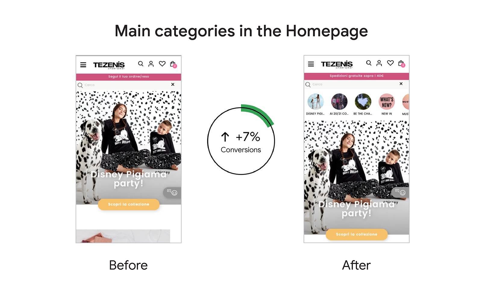
Adding the main product categories to the homepage generated both an increase in mobile conversions and in total revenue, as it made categories easier to find. We chose the categories among the most popular ones according to Google Analytics data; this impacted even more positively on conversions.
On Tezenis Italia we noticed an 8% increase in the conversion rate and a 7% increase in conversions after updating the homepage and adding the main categories front and centre.
2. Insert a search bar on the homepage
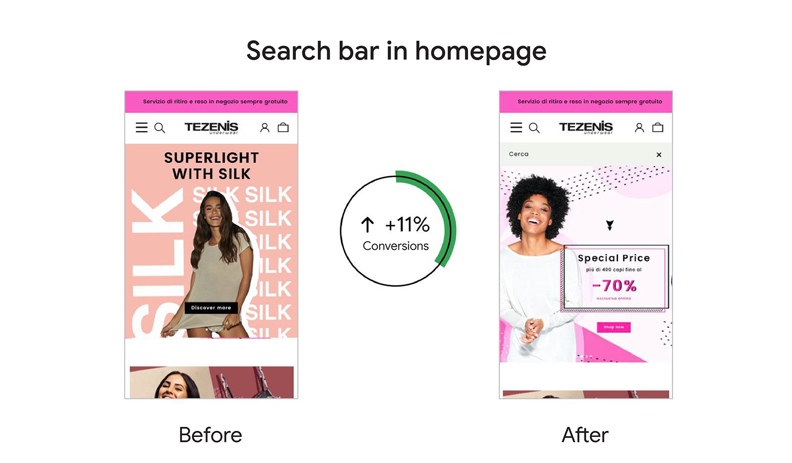
Showing the search bar on the homepage was the test that generated the highest increase in conversions and sales. It reached an increase of 11% in conversions and 15% in turnover depending on the country.
This does not surprise us because from our experience, customers who use the search function on the site are more likely to buy. The search bar should always be shown, especially on a site with a large product catalog.
3. Insert the images in the hamburger menu
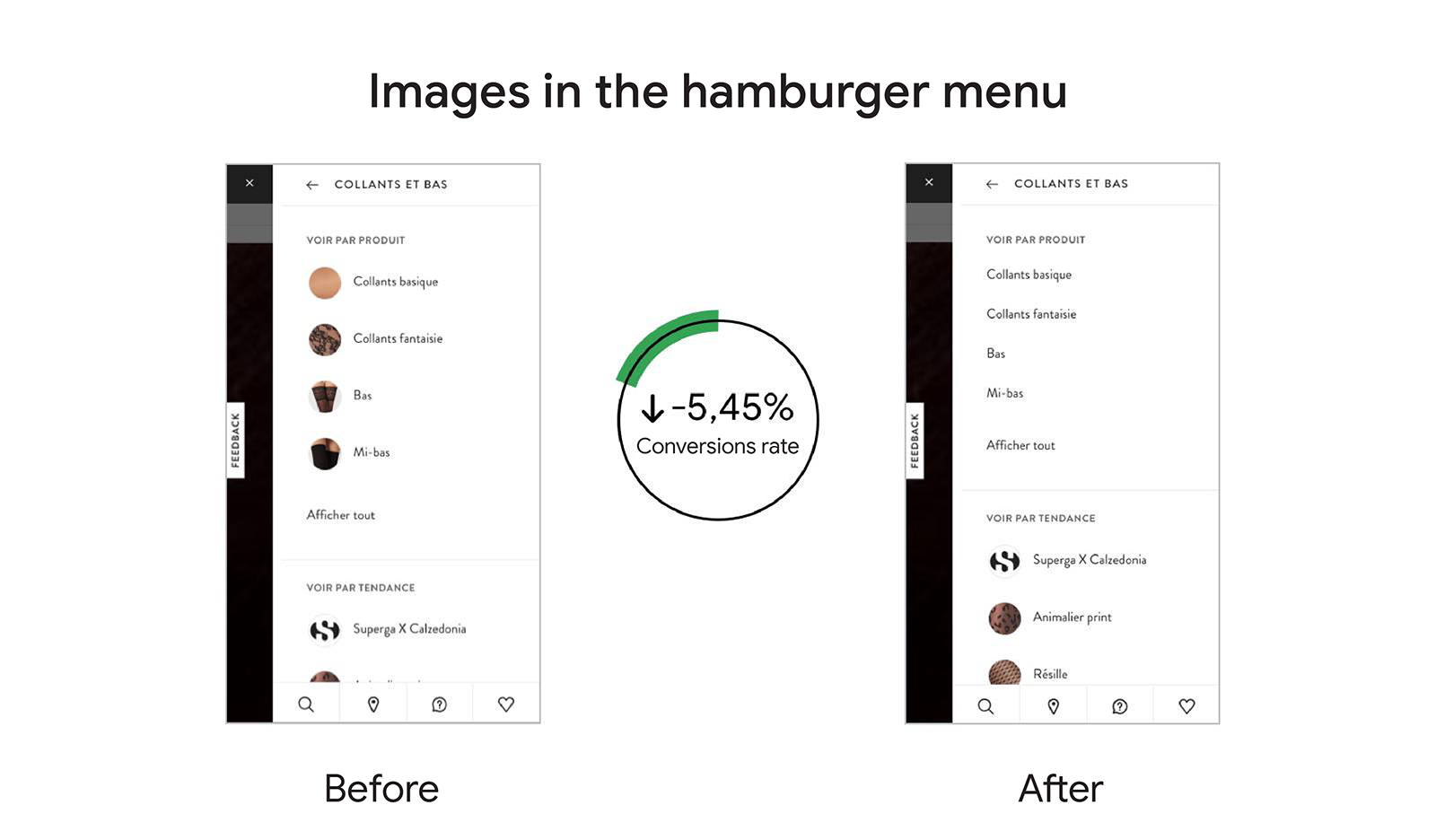
The images in the hamburger menu (the typical menu of mobile websites with three lines that makes it look like a hamburger) help with understanding and conversions. Tests on different brands have shown that the images within the main menu help navigation and also have a positive impact on the conversion rate.
In Calzedonia France, for example, we tested the removal of images in the hamburger menu and found a drop in the conversion rate of 5.45%.
4. Make the product description clear
On the Tezenis products page, the brand had given ample space to the images, leaving the description of the single product hidden, visible only by clicking on "Description").
Tests have shown that if the detailed description of the product is always visible this has a positive impact on conversions, in this case it was a 3% uplift.

5. Don’t add surprises at the checkout stage
Checkout is the most delicate phase of the purchasing process. According to research by Statista, as many as 82% of retail shopping paths stop at the cart. The reasons range from surprises in shipping costs, to using the cart as a wishlist to compare prices. Research in 2015 identified a perceived lack of safety as a reason for cart abandonment, but the same research conducted in 2019 no longer finds this motivation as the primary one.
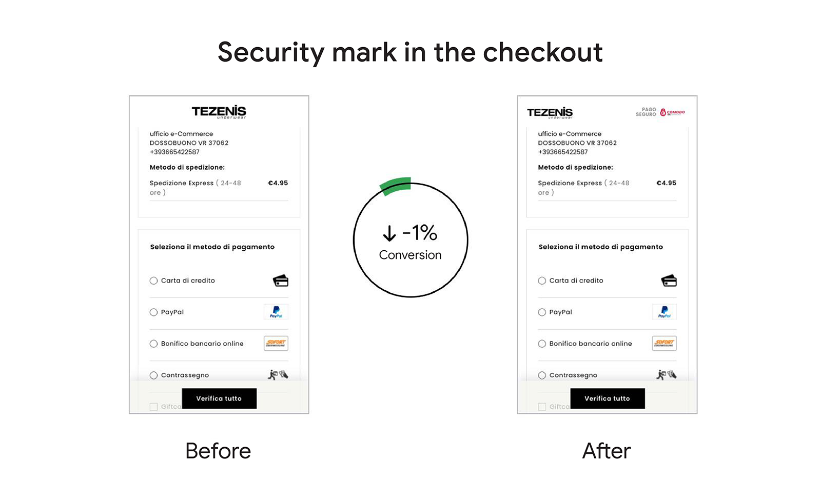
With the Tezenis brand, however, we tested the addition of a safety mark in the cart and we found that this had a negative impact on conversions. A demonstration that every assumption must be tested and that the needs of those who surf a site change over time.
