Actionable steps you can take to better relate to and serve the accessibility needs of web users.
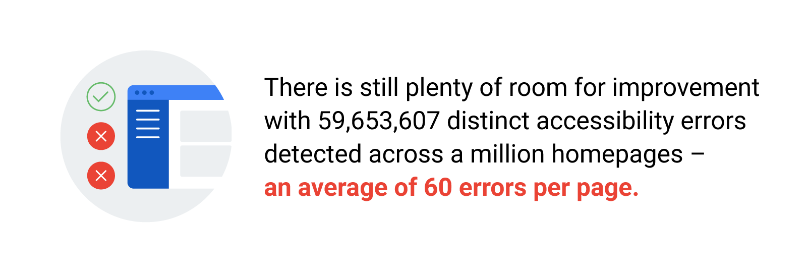
Global Accessibility Awareness Day takes place annually on the 16th of May, but this is a topic that deserves more than 24 hours of attention. The global market of people with disabilities is over 1 billion, with a spending power of more than $6 trillion.1 Although accessibility awareness is on the rise and many companies are making good progress, there is still plenty of room for improvement with 59,653,607 distinct accessibility errors detected across the 1 million home pages—an average of 60 errors per page.2
Even if you have clear vision, hearing, movement, or cognitive abilities, it’s important to consider the different needs of users. Bias can limit the ability to build websites that work better for everyone – unless efforts are made to understand more about diverse users and the accessibility topics that affect them.3
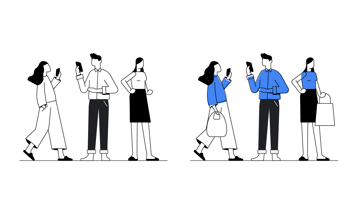
According to the curb cut effect, designing for accessibility delivers benefits for all.4 Here are five tips to help you increase your website’s accessibility and build a better web for everyone.
Tip 1: Help users navigate your site with clear layouts
Globally, it’s estimated that approximately 1.3 billion people live with some form of vision impairment.5 Yet a study of 1 million sites found that low contrast was the most common accessibility issue.6

To make life easier for this significant user base, it’s important to provide sufficient font sizes and colour contrast.7 In doing so, you’ll also make screen viewing easier for other mobile users, who may struggle to read small or illegible fonts when they’re on the go.
Tip 2: Use language and structure that’s intuitive and concise
Users have varying levels of cognition and reading abilities. And though English may be the most dominant language on the web, it’s not that widely spoken or understood across the globe. Aim to make content as clear and concise as possible so that people can understand and digest it easily. Use plain language and try to avoid specialised or technical terminology.8
Clear headings and layout go a long way towards helping users understand the hierarchy of content and where they are on the page. In turn, this also benefits your SEO efforts by helping search engines understand what’s important.
Mobile users may have little time to digest information, so it’s good practice to display your value proposition above the fold. As a bonus, this technique can help boost your conversion rates too.

Tip 3: Offer easy data entry to accommodate more users
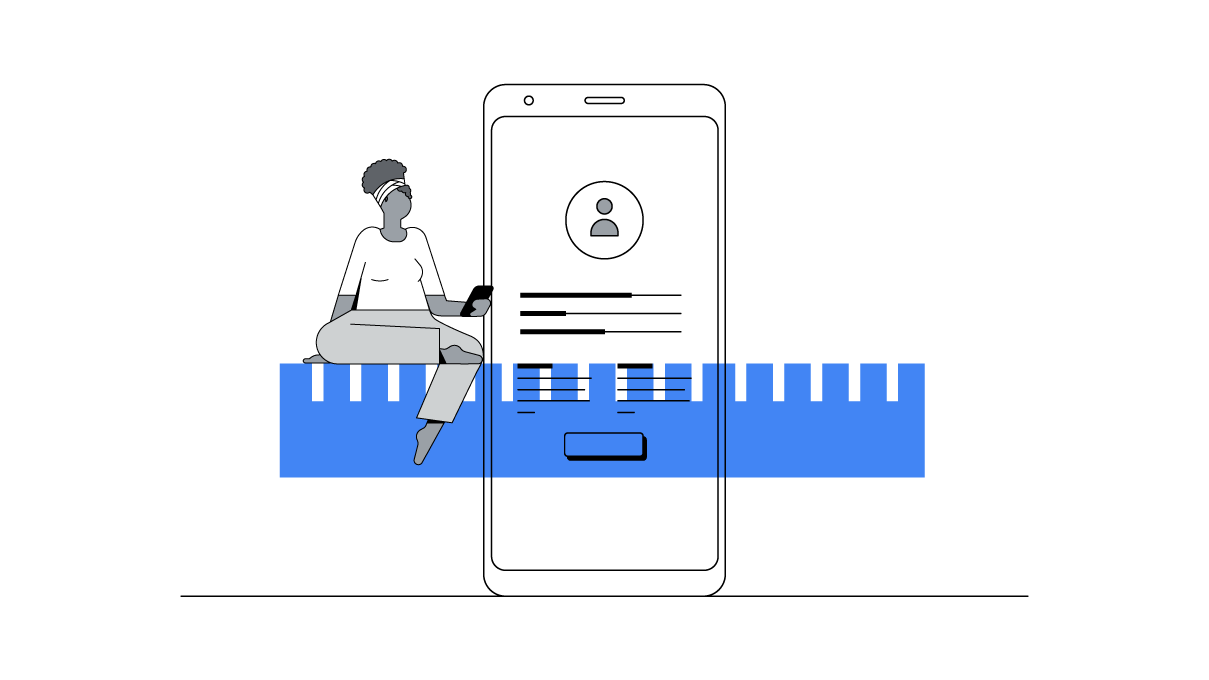
For people with limited dexterity, typing on mobile can be hard. Many sites include some form of data entry, so it’s important to use input formats that reduce friction for users.9 For example, consider offering a number pad for entering numbers and providing expanded options or autocomplete text fields as opposed to drop-down lists.
All users benefit from minimising the need to type or enter text search terms. Voice input is an example of a feature developed for accessibility needs that’s been rolled out for the wider public10, so take advantage of opportunities to offer it.
Tip 4: Be mindful of slow networks by designing pages that load fast
An important accessibility concern for global audiences is around slow and unstable network connections. With mobile more prevalent than desktop in many regions, low bandwidth creates a challenge for users in accessing data.11
For businesses and marketers, the answer is to design pages that load as quickly as possible and then optimise your mobile site speed on an ongoing basis. You will not only give users a better experience, but also stand to make considerable gains in conversions.
Tip 5: Support assistive technologies specific to your platform
Just as you support the input methods of touch, keyboard, and mouse, making use of assistive technology helps increase, maintain, or improve the capabilities of individuals with disabilities. Examples of assistive technologies include screen readers, magnification devices, and hearing aids.
To cater to users with visual and motor impairments – and on-the-go mobile users in general – the tappable areas that define links should be large and easy to reach. Study the parts of the screen that users can reach with just a thumb, then design accordingly.12
Users may rely on keyboard shortcuts due to motor impairments or simply to be more efficient. Introduce a good keyboard navigation strategy to create a better experience for everyone.13
To uncover further opportunities to make your site more accessible, run your site through a basic accessibility audit using web.dev. You can discover your audit scores, learn best practices, and gain recommendations for improving your site’s accessibility and speed.
Disclaimer: These materials are for your information only, and do not constitute legal advice. You should consult your attorney for advice on any particular issue


