In conjunction with usability experts cxpartners, Google has reviewed almost 500 most visited sites in Retail, Finance and Travel verticals across Europe, Middle East and Africa to find out who are the mobile masters, and who still need to improve.
That we now live in a mobile world will not be news to most marketers. As smartphones have become ubiquitous, so consumers have become accustomed to being able to get things done on the go. With a powerful portal to the web in their pockets, they expect to be able to book a flight, open a bank account or buy a new set of headphones as easily as searching for a nearby restaurant or sending a message to a friend.
But in many cases, expectations are still some way ahead of reality. Mobile sites can be slow, with confusing navigation and unwieldy checkout processes that involve filling in multiple fields and completing multiple steps before purchase. When sites have these kind of shortcomings, consumers are inclined to abandon them. If you’re lucky, they may return to your site when they’re back on a desktop or laptop computer, but in the worst case scenario, they leave and never come back.
This is why the speed and usability of mobile sites are so important - and not just for developers. The pace of innovation in interaction design means that user expectations are constantly evolving, so marketers need to have absolute confidence in the quality of the mobile experience being promoted by their campaigns. Speed and user friendliness should be obsessions, but because of this rate of change, it can sometimes be hard to know exactly what good looks like right now.
Following a 2016 study, Google analysed the usability and speed of some of the most visited websites in Retail, Travel and Financial Services across Europe, Middle East and Africa to identify the “mobile masters” in each country and vertical.
The results revealed Coolblue to be the mobile master in European Retail, Bank Norwegian to be the top brand in Finance, and Booking.com as the most user-friend Travel site.
In this article, we’re going to take a closer look at the results of UK brands in our study.
Retail
The top brands in Retail in the UK are: etsy, Asda and eBay
Mobile Site Benchmark 2018 - UK Retail Top 10
Brands score higher when there has been a company-wide policy to improve mobile experience:
"With the vast proportion of our visits coming from mobile devices, ASOS is a well and truly mobile first business. Over the last 12 months we have really been focusing on improving our customer experience by improving the site design and improving performance. We have made some great headway and this in now embedded as part of everything we do."
- Andy Mills - Web Platform Lead, Asos

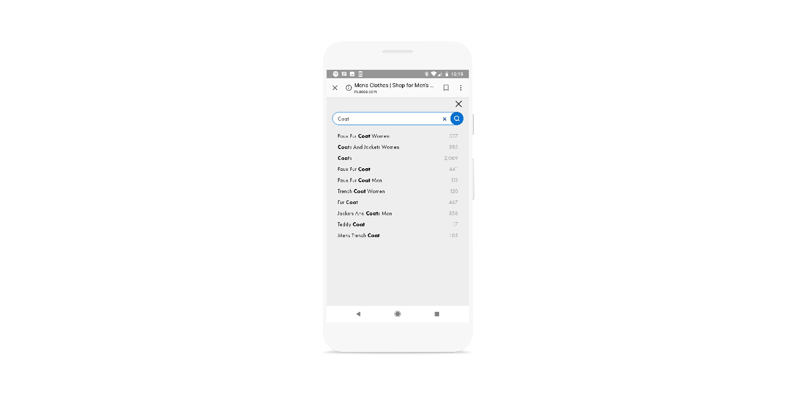
One of the first insights from the study is that compared to previous years, Retail sites have improved their search functions. Cognisant of the fact that small screens can lead to spelling errors on mobile, many site such as Asos.com now anticipate misspellings and automatically correct. However, few sites show the original query, leaving open the possibility of miscorrection when choosing between words with similar spelling, such as ‘shirts’ and ‘shorts’.
The study also showed that in addition to the convenient one-page checkout processes exemplified by sites such as Newlook.com, more and more Retail sites are adopting third-party payment systems such as PayPal, Google Pay or Apple Pay. These integrations offer the potential to significantly streamline checkout for users who are already signed up to a payment system, but there are also potential pitfalls. If integrated carelessly, they can result in customers having to input address details on both the site and the payment provider, lengthening checkout and increasing the likelihood of frustration. On a final technical note, our research also revealed that while many Retail sites use secured checkout (via https://), there are still some who have yet to secure their entire site.
Travel
The top brands in Travel in the UK are: Booking.com, Kayak and lastminute.com.
Mobile Site Benchmark 2018 - UK Travel Top 10
Travel bookings tend to be relatively high value, so providing clear information to reassure users during checkout is crucial. In this respect, Booking.com excels, with the full price displayed prominently throughout the purchase process. Progress through the checkout flow is clearly indicated by a status bar, and users can click back and forth between pages without losing and having to re-enter details.

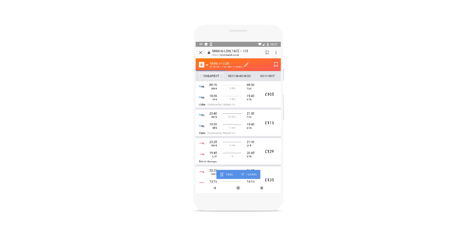
Similarly to developments in Retail, Travel sites such as Kayak.co.uk have invested heavily in improving their mobile search functionality, offering helpful autofill and powerful filtering options to render results manageable on small screens. Kayak are also among the top performers in mobile-friendly design, with clear layouts, readable headers and icons well-sized for use on touch screens.
Finance
The top brands in Finance in the UK are: Confused.com, uSwitch, Tesco Bank, comparethemarket.com and the Cooperative Bank.
Mobile Site Benchmark 2018 - UK Finance Top 10
Finance sites tend to be quite fast, as they don’t have to deal with the large quantity of products and associated data that Retail and Travel websites have to accommodate. However, while banks have fewer products for users to choose between, the details informing those choices can be quite complex. In this respect, barclaycard.co.uk does a great job by providing an interactive tool that helps visitors find the product they need.
“Over the last few years, we’ve grown our UX, Design & Research function which has enabled us to put the customer first much more often and solve real customer needs. Going out and testing the site with customers each week generates an excellent feedback loop for our product teams to help them move faster whilst delivering value. Having grown the UX function, it’s helped to gradually shift the company’s culture to a hypothesis driven approach with a rigorous Lean UX & dual track agile process. It has helped to improve page speeds, reduce friction in the journey and help customers to navigate the paradox of choice they’re faced with on a price comparison site.”
- Rich Clark - Head of UX and Design, moneysupermarket.com
While less content means that finance sites generally score well on speed, a few common usability issues emerged in our study. Some banks remove the search function from their mobile site, despite this arguably being the use case where it is needed most. Likewise, autofill is often implemented poorly, introducing unnecessary difficulty and frustration.
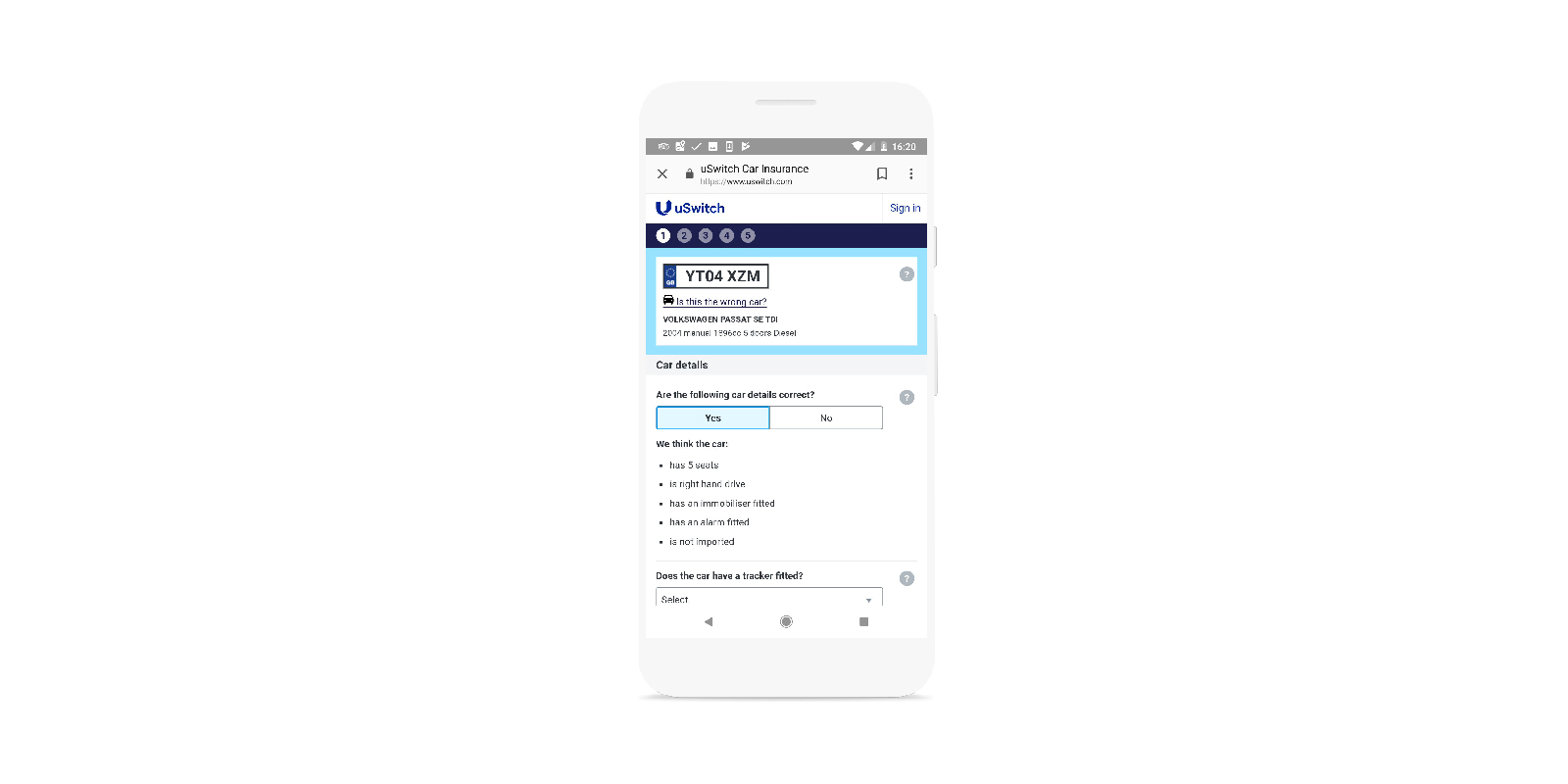
Signing up for financial services can involve inputting a lot of information, and uSwitch.com does an excellent job of explaining why each piece of information is required, and showing clear error indicators when the user responds incorrectly. Moreover, the uSwitch site retains user inputs, enabling visitors to navigate back to the previous step without losing pre-filled data.

On average, the three UK verticals scored between 64-73% in our usability survey, meaning that there’s still plenty to do to optimise the mobile user experience. If you want to find out how your own site compares, you can consult the heuristic framework used in the study and use the Lighthouse tool to automatically audit the performance and quality of your site. To find out more, please read the full text of the study and consult our archive of best practice advice.


