Karen Weibrecht is the marketing manager at Volkswagen Middle East. Her expertise in customer experience and brand strategy has helped pave a new path for a better, more dynamic user experience on the Volkswagen website.
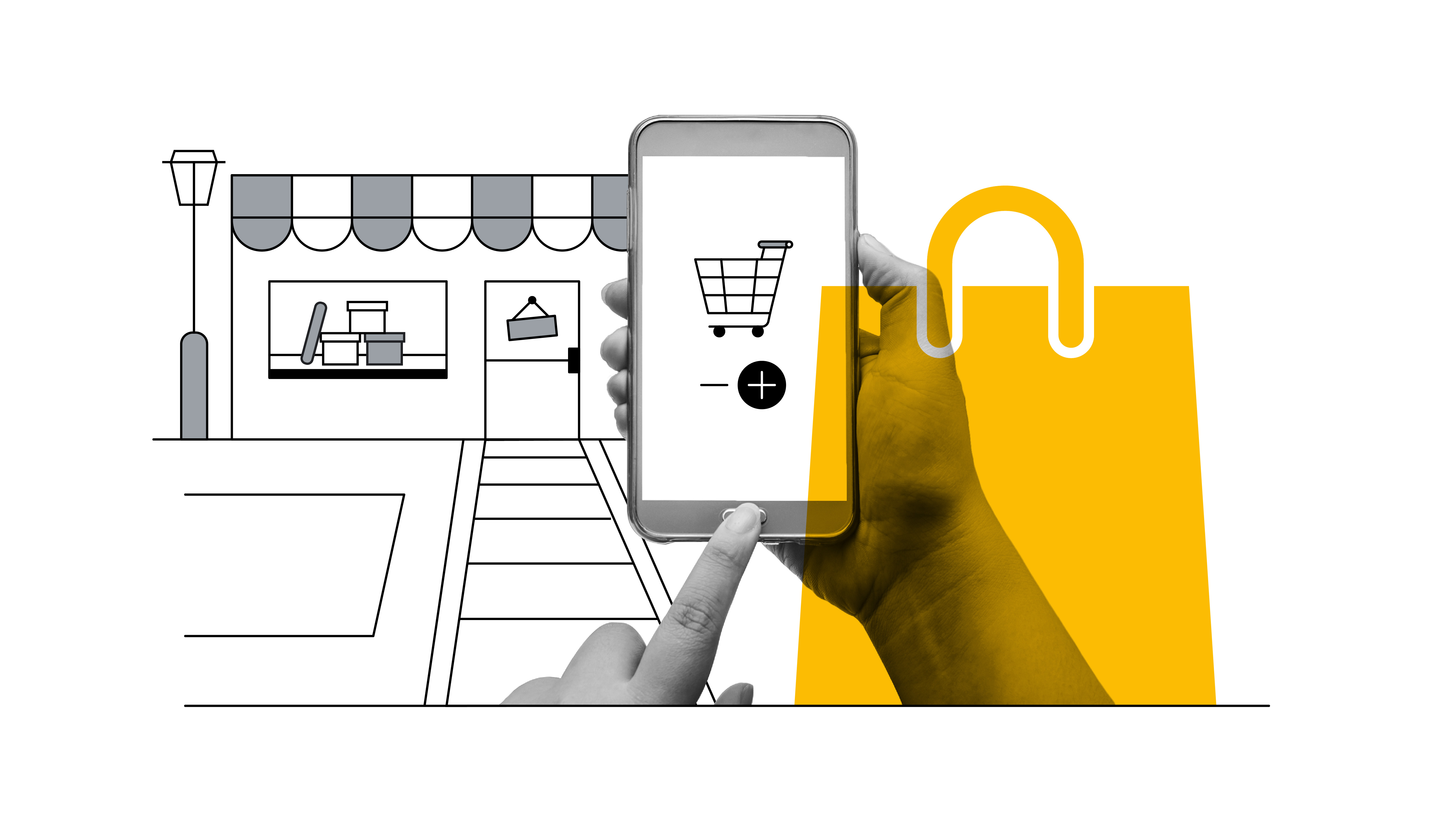
Imagine you are a car dealer: a potential customer comes to your showroom, decides on the exact model they are interested in, and says they will be back to finish their purchase. Now imagine they come back, but you forgot everything about them. The model, the specs… gone.
This is the challenge of car-buying research online. Here at Volkswagen Middle East, we set out with the goal to shorten the gap between exploration and purchase decision for customers searching for their dream car. A better user experience on our website was crucial.
Our data showed that not all car buyers who showed interest in a Volkswagen car actually took the action of filling out a form or contacting us. So, we wanted to address this opportunity to convert interested car buyers into a test drive and subsequently, a sale. We saw the website experience was crucial to improve conversion rates and drive media efficiency.
A complex customer journey
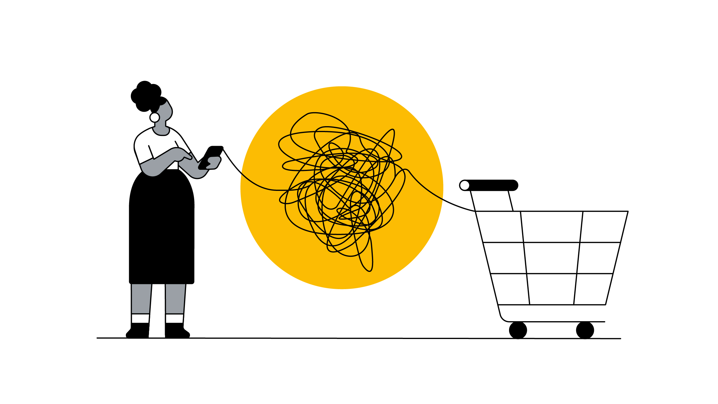
Buying a car is a complex process that involves buyers visiting an average of 6.6 online touch points,1 including competing brand websites, review forums, and comparison sites, before making a decision.
Throughout their journey, customers will have seen ads with creatives tailored to their needs; however, once they accessed our website, the personalisation came to a halt. We wanted to create a new, highly dynamic site that drives momentum by allowing audiences to pick up where they left off.
The power of dynamic creatives
Delivering ads with relevant creatives is tried and tested for us at Volkswagen, so we wanted to develop this by interlinking our website into the process. To do so, we partnered with Smart Digital, a strategic marketing agency based in Germany, who helped us leverage the power of AI technology.
We were able to deep dive into user behaviour, picking up on buying signals and plucking out relevant information to adapt our media strategy to what potential customers would want to see. This ensured we delivered the best quality in terms of information, and ultimately, used our media budget in the most efficient way.
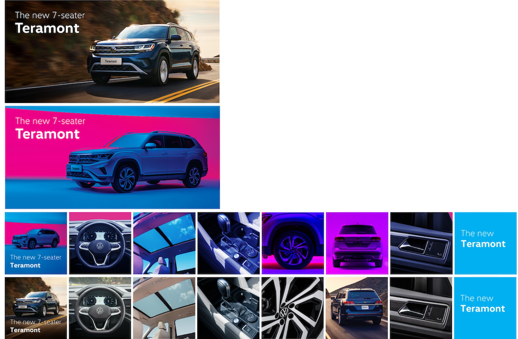
Once it was clear that a particular audience was high intent for a particular model, with the help of first-party data, we customised our website in real-time by tailoring creatives and presenting relevant imagery, messaging, and touch points with the help of automation. For example, the creatives used for a younger demographic were more vibrant and used messages that would resonate with the audience as can be seen below:

Phases of the funnel
To fully tailor the user’s experience, we had to understand where audiences fell within the funnel to ensure they only saw content they were actually interested in. We split the funnel into three distinct phases; awareness, consideration, and lead-driving.
A customer in the early awareness phase will see a tailored webpage with relevant content front and centre, like a brochure so they can browse their options. Alternatively, a customer in the second stage of the funnel will see a different version of the website, which could be based around the specific car they showed interest in, for example.
We used this three-stage funnel approach offsite too to structure our ads. To ensure potential customers did not get overwhelmed by seeing the same ad multiple times, we customised content based on where they were in the funnel. This also removed the risk of audiences being overwhelmed by being exposed to lead forms too early.
New buyer audience
We have seen a rapid shift in our audience since the Saudi government changed their rules to allow women to get their driver's licenses. This empowered us to build fresh creatives to connect with this new audience once they landed on our website.
This approach required testing. For example, we had two different approaches to the creatives used for the 7-seater Teramont, based on the audience demographic. While the first approach was traditional, the second incorporated bright colours like blue and pink.

Delivering a tailor-made experience
Our tailored website experience led to a 2X increase in conversions compared to that of the old website, resulting in more people filling out test drive forms and more visits to the showroom.
Overall, we were able to lower our cost per lead by 64% vs our standard lead generation efforts, while boosting lead quality by 25%. By using new digital tools to optimise media investment and improve the KPIs of our website, we experienced our highest sales month ever to date in October 2021. I know it sounds cheesy coming from a car company, but the Volkswagen marketing team loves driving results. This website overhaul helped us put the pedal to the metal.


