More shoppers than ever are browsing on their mobile devices. However, according to our latest findings, seven out of 10 shoppers do not end up making a purchase on a mobile site.1 Why does this happen, and what can retailers do to drive both customer experience on mobile and revenue?
In a study conducted with research agency SKIM, we surveyed over 20,000 consumers in 15 different countries across Europe, the Middle East, and Africa — and across categories such as fashion, consumer electronics, personal care, and home and garden.
This research shows that seven out of 10 mobile shoppers do not make a purchase because the site made the process either too difficult or frustrating. Of those customers who start to browse, four will buy elsewhere (offline, app and desktop), while three (30%) end up not purchasing anything. Only six percent of users simply don’t purchase due to personal preference: in other words, no matter how great your mobile retail site, some consumers simply prefer to buy through their own favoured channels.
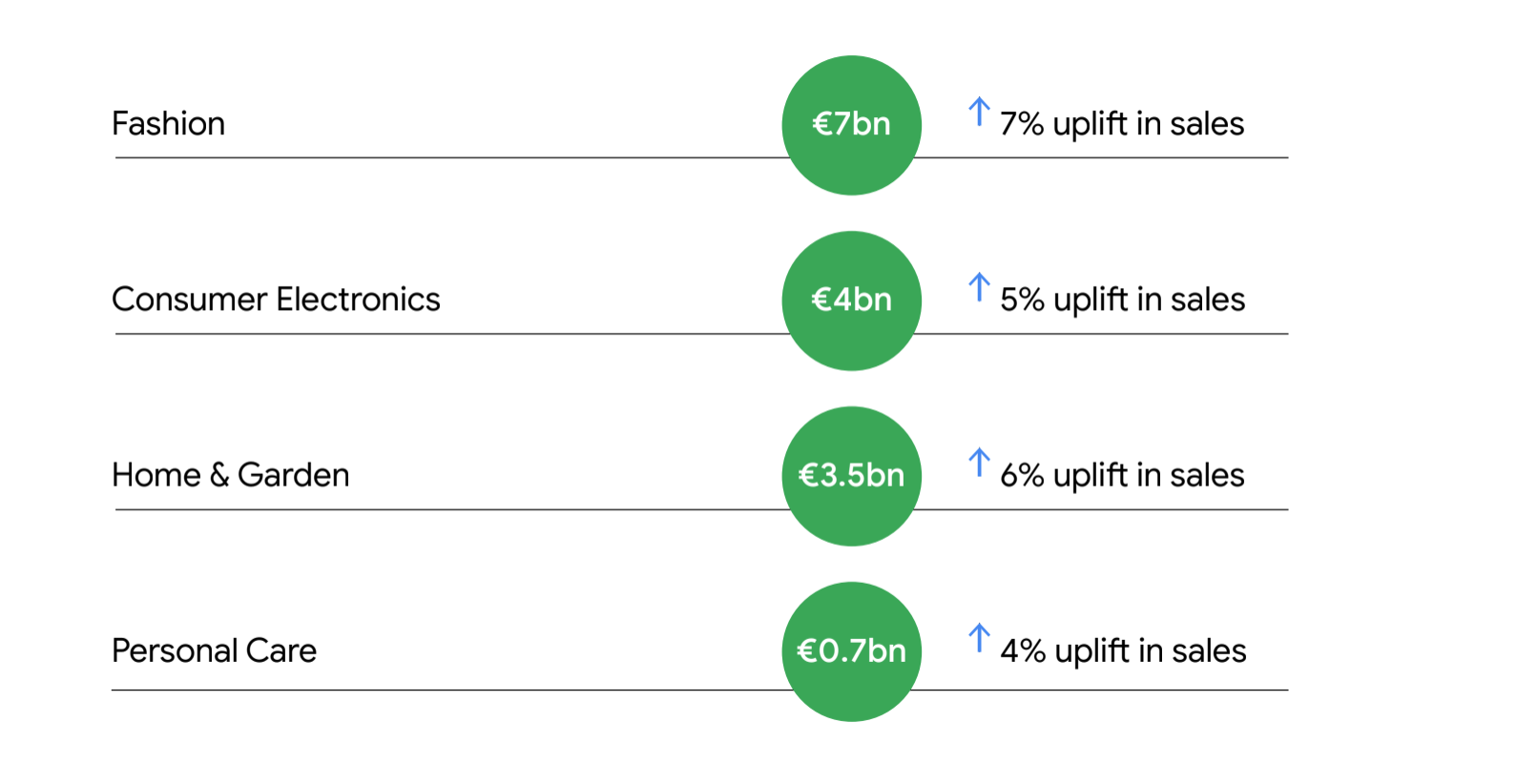
During the coronavirus outbreak we have seen those who never bought on their smartphones turn to mobile shopping. At the same time, site speed and a lack of up-to-date information became bigger issues than before the crisis. Overall the results highlight that missed opportunities on mobile could mean billions in untapped annual revenue — but they are relatively easy to address.
5 make-or-break mobile shopping pain points
According to the study, there are 10 major pain points when it comes to mobile shopping, and eliminating just the top five presents a significant opportunity for retailers.
Untapped mobile opportunity per retail category2

1. Eliminate scrolling fatigue
Searching for the best option out of hundreds can feel repetitive and aimless. Scrolling on a mobile device, when only one or two products can be viewed at a time, can make some customers decide to put off their search. Scrolling fatigue was the most common barrier to purchase, and can be tackled in a number of ways:
- Help users to quickly scan the information about your products by adding standard components for site layout (features such as headers, footers, a sidebar, and the ability to favourite products for later: provide top categories, show the number of items loaded, and the total number of results.
- Simplify your site navigation by implementing a sticky menu that doesn’t disappear as the user scrolls down. You can also encourage users to search by making the search bar visible, and demonstrate relevant results, as well as providing prominent and extensive filtering.
- Personalise the experience to different audience segments. For example, a sports retailer may show different messaging to new customers than to more experienced athletes. You can also encourage purchasing decisions with relevant messaging, such as indicating when a product is low in stock.
2. Improve your website’s autofill
It can be frustrating for a user if they can’t easily retrieve personal information, such as their shipping address or payment details. Typing in small form fields on a smartphone can also be tricky, and users are wary of making mistakes. This was the second most common barrier to purchase, which also can be overcome:
- With the correct autofill attributes, users can complete forms up to 30% faster.3 Check that yours is implemented correctly and tailor fields like street names and postcodes to the countries you operate in. Google Places API can be useful in addressing this problem. It is also best practice to give users real-time feedback when they make mistakes.
- Skip filling in forms altogether by leveraging one tap sign-in functionality, and adopt easy payment methods such as Google Pay, PayPal, and others. Make sure you are providing a breadth of payment solutions relevant to the region you operate in.
3. Make comparing products easy
Shoppers today have an abundance of choice at their fingertips, going through a constant process of exploration and evaluation to ensure they are getting value for money. Comparing products with other retailers can be particularly cumbersome on mobile, where you don’t have the luxury of multiple tabs as you might on desktop.
- Allow users to skim the results and add the ability to compare items. Highlight product benefits like “5-year guarantee” or if an item is part of an “exclusive collection”. With app-like functionality users can save websites to their home screen to come back to later, while Shopping ads are used by many customers to compare products across different merchants.
- If you price match products, let your customers know about it. Clear return policies and shipping information also give customers peace of mind.
4. Bring products to life online
When shopping online, it is often hard to understand how a particular item will look in real life. If products or experiences are not optimally represented on your site, customers won’t feel completely confident in what they receive.
- Give customers a clear idea of what they’re buying through comprehensive product descriptions, size guides, and comparisons. If a product’s appearance matters, use high-quality imagery from different angles with landscape-friendly design.
- For some products, you may want to explore the use of video, 3D views, and even augmented reality.
5. Give customers all the facts
Shoppers hate to find out critical information about their purchase — like stock availability, delivery times, and additional charges such as fees and taxes — at the final steps of the checkout process. Be transparent about the full costs, and provide key information in a concise way. Our Designing for Uncertain Times playbook also provides tips on addressing these issues.
As mobile shopping continues to grow, brands that provide the best user experience from landing page to checkout will have an advantage over their competitors. Download the full report to dive into the data relevant to your business.


