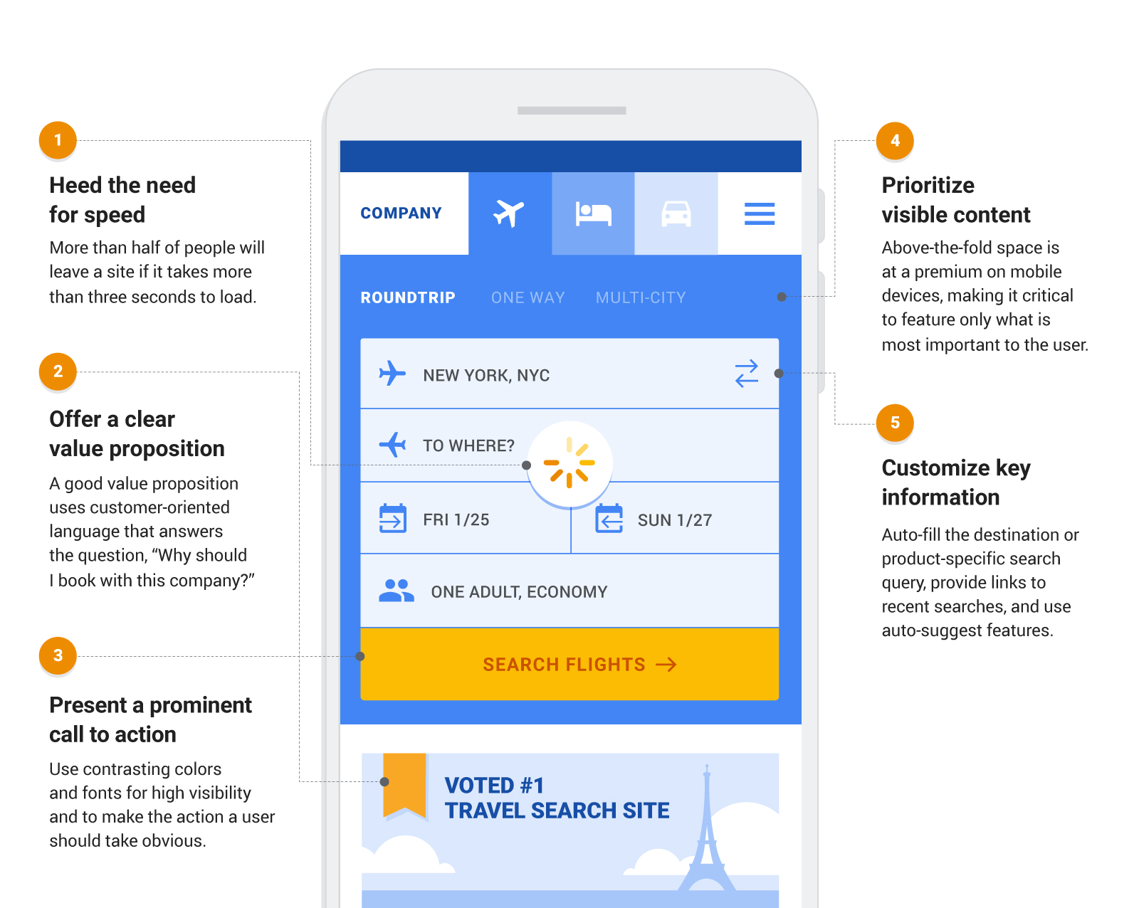
As a marketer, you might be spending a lot of time ensuring your ad creative is compelling and on brand. But are you spending enough time with your mobile design team? Ensuring the post-click experience is relevant and engaging is as important as the click itself. Research shows that when choosing a brand to travel with, an easy-to-use website matters more than online reviews or even loyalty programs to high-value travelers.1
High bounce and low conversion rates can be signs that your landing page experience doesn’t match people’s expectations. And remember, metrics that prove the value of marketing, like return on ad spend or cost per action, depend on what happens beyond the click. To deliver value to your customers and reap return on your ad spend, travel marketers must understand and be invested in the user experience beyond the first click.
If you know you need to improve your mobile experience but don’t know where to start, here are five principles for effective mobile landing pages to help determine which areas need attention and investment.
5 principles of effective travel landing pages for mobile

1. Heed the need for speed
More than half of mobile site visits will be abandoned if a mobile site takes more than three seconds to load.2 Track your site’s speed performance using PageSpeed Insights, powered by Lighthouse. Also determine if technology, such as Accelerated Mobile Pages or Progressive Web Apps, might further improve your site’s performance. Expedia did just that and spent the last 18 months developing a cloud-native, optimized PWA-based web platform that powers its hotel shopping path and mobile landing pages. Expedia now delivers pages 2X to 3X faster than before.
2. Offer a clear value proposition
A mobile landing page should demonstrate how the product solves a customer problem, delivers benefits, or is better than its competition. And it should immediately reassure the user that they came to the right place. A good value proposition uses customer-oriented language that answers the question, “Why should I book with this company?” For a cruise company, for example, the call-out might be “Voted No. 1 Cruise Line,” while a hotel brand might feature “More properties in Europe than any other brand.”
3. Present a prominent call to action
The action a user should take must be obvious on a landing page. User research can help identify what travelers expect to do when arriving on a site. Once you’ve established a clear call to action, use contrasting colors and fonts for high-visibility and large, easy-to-tap buttons. And ensure there is no latency in advancing the user to the next page in the flow. For key CTAs, like “book now” or “contact us,” consider displaying the action button more than once or implementing an always-present or floating CTA.
4. Prioritize visible content
Above-the-fold space is at a premium on mobile devices, making it critical to feature only what is most important to the user. Reduce navigation links and nontransactional elements that can be distracting to the user. On search results pages, show enough examples to indicate a breadth of options without cluttering the page. On product-specific mobile landing pages with heavy imagery, allow the user to swipe through images instead of autoloading a carousel. While images certainly inspire and reassure travelers, they can slow down your site. Your developer team can optimize the images both for quality and for speed.
5. Customize key information
Travelers expect a mobile site to automatically integrate relevant or personal information. In fact, 61% of people say they expect brands to tailor information based on their preferences.3 Achieve this by auto-filling the destination or product-specific search query, providing links to recent searches and using auto-suggest features. Leverage signals from the mobile device, such as geographic location and time of day. Best-in-class landing pages incorporate contextual information based on the visitor’s stage in the funnel, demographics, or interests, and dynamic landing pages should deliver contextual relevance within a consistently strong user experience. The more targeted the mobile landing page, the better.

Now is the time to align your organization around these best practices. A recent study shows that people who have a negative experience on mobile are 62% less likely to purchase from that brand in the future than if they have a positive experience.4 Remember that anything travelers expect to accomplish online should be just as easy to accomplish on mobile devices.
Today, 48% of mobile users in the U.S. are comfortable researching, planning, and booking an entire trip to a new travel destination using only their smartphone.5 This presents an enormous opportunity for travel brands to deliver better experiences on mobile devices, beginning with the first page a user sees. As marketers, you can lead the charge in making your mobile site the assistive and delightful experience customers are looking for.


