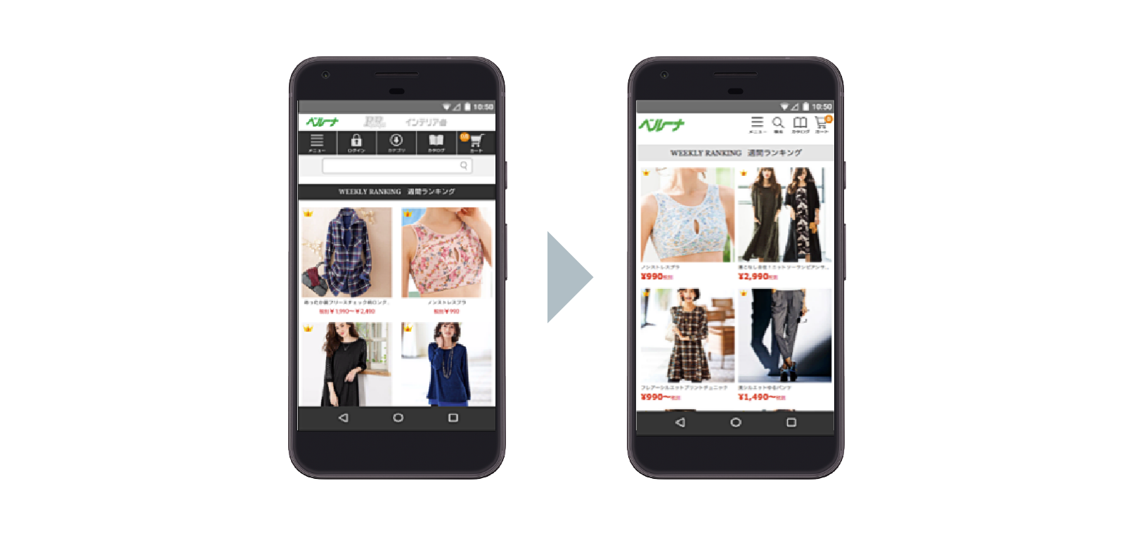
After humble beginnings in the mail order industry, Japanese retailer Belluna has since evolved and expanded to serve more than 15 million customers both on- and offline. The brand’s mobile site was designed to resemble its successful print catalog, but after years of updates that piled on excessive site elements, Belluna’s mobile customers were left with a suboptimal shopping experience. Creating a more seamless experience required an all-hands clean-up effort and a few new tools.
GOALS
Create a smoother shopping experience for mobile users
Increase online orders from mobile
APPROACH
Conducted a series of site improvements with strategic support from senior leadership
Stripped old files and scripts on existing site
Set up Accelerated Mobile Pages (AMPs) to improve landing page loading times
Created Progressive Web App (PWA) for easier navigation to mobile site
RESULTS
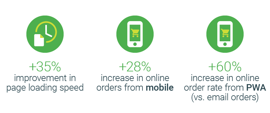
28% increase in online orders from mobile
60% increase in online order rate from PWA compared to e-mails
Average page loading time reduced to 0.62 seconds—8X faster than before the AMP roll-out
Today’s mobile consumers in APAC have higher expectations than ever before—especially in Japan, where 70% of consumers own a smartphone.1 With nearly instant, 24/7 access to information on the go, it’s no wonder that 53% of mobile visits are abandoned if a site doesn't load within three seconds.2 The implication for brands is clear: create intuitive, simple mobile site designs that make it easy for customers to find essential information or risk losing their attention—and business.
After starting as a mail order catalog business in 1986, Japanese retailer Belluna eventually expanded to digital with a robust website and online store. The brand’s mobile site, which launched in 2012, was designed to resemble its highly successful print catalog, but years of successive updates to the site resulted in slower page loading times. To offer its customers as smooth a mobile experience as possible, Belluna mapped out a three-step improvement process:
- Strip old files, scripts, and unnecessary site elements
- Roll out Accelerated Mobile Pages
- Create easier access on mobile with a Progressive Web App
The brand’s effort resulted in a simpler site design, faster page loading times, and an impressive lift in online orders from mobile.
Belluna gets inspired to improve its mobile user experience (UX)
After trying simple fixes like reducing image sizes to improve its site UX, Belluna looked into its average page loading times. Based on consumers’ growing expectations for speed and simplicity, the brand knew that every time a page takes more than three seconds to load, potential sales are cut in half.
Managers from each department started by testing the brand’s mobile site for speed and overall mobile UX friendliness, and they found that both factors were below recommended values. The managers took their findings to the company’s executives and top management. With the senior leadership’s full buy-in and support, the brand established a dedicated team to support and carry out its plan to clean up the site UX, prioritizing steps with the simplest implementation but greatest effect on speed.
"A major factor in the success of this project was that we got the whole company on board...That enabled us to implement an improvement plan focusing on both user experience and speed, not just one or the other."
Mitsunori Hasunuma, the sales department manager in Belluna’s e-commerce business division, explained the importance of a company-wide effort: “A major factor in the success of this project was that we got the whole company on board—not just the technical staff responsible for the user interface. Everyone understood the basic ideas of user interface, user experience, and ways to improve site speed. That enabled us to implement an improvement plan focusing on both user experience and speed, not just one or the other.”
Stripping down the old site and rolling out Accelerated Mobile Pages
Belluna decided to work with its existing site for two reasons: 1) so it wouldn’t lose the SEO value it had built up, and 2) rolling out AMPs for landing pages was much easier to implement than building a new site from scratch.
Before bringing on the AMP support, the brand decided to first remove from the site old files and scripts, many of which had no obvious function, that had accumulated over several years of updates. A dedicated team spent more than six months sifting through each file and script, keeping essential elements, such as product images and prices, while creating a simpler menu bar for easy site navigation. Simplifying the overall design ensured that users could easily and quickly find what they were looking for as they browsed the site.

The next step was to make sure the site’s landing pages would load consistently and quickly for customers navigating to the site from organic searches and mobile search ads. Enter AMPs: mobile web pages that rely on custom HTML elements and pre-cached resources to load instantaneously on any type of mobile device. The combination of a simpler site design and AMP-supported landing pages ensured that Belluna’s customers would have no trouble loading and navigating the brand’s mobile site.

Introducing the new AMP reduced Belluna’s page size from 3.6 MB to 500 kB, and the average page loading time for smartphone pages was cut to just 0.62 seconds—8X faster than before the AMP rollout.
Building a Progressive Web App for easy access to the mobile site homepage
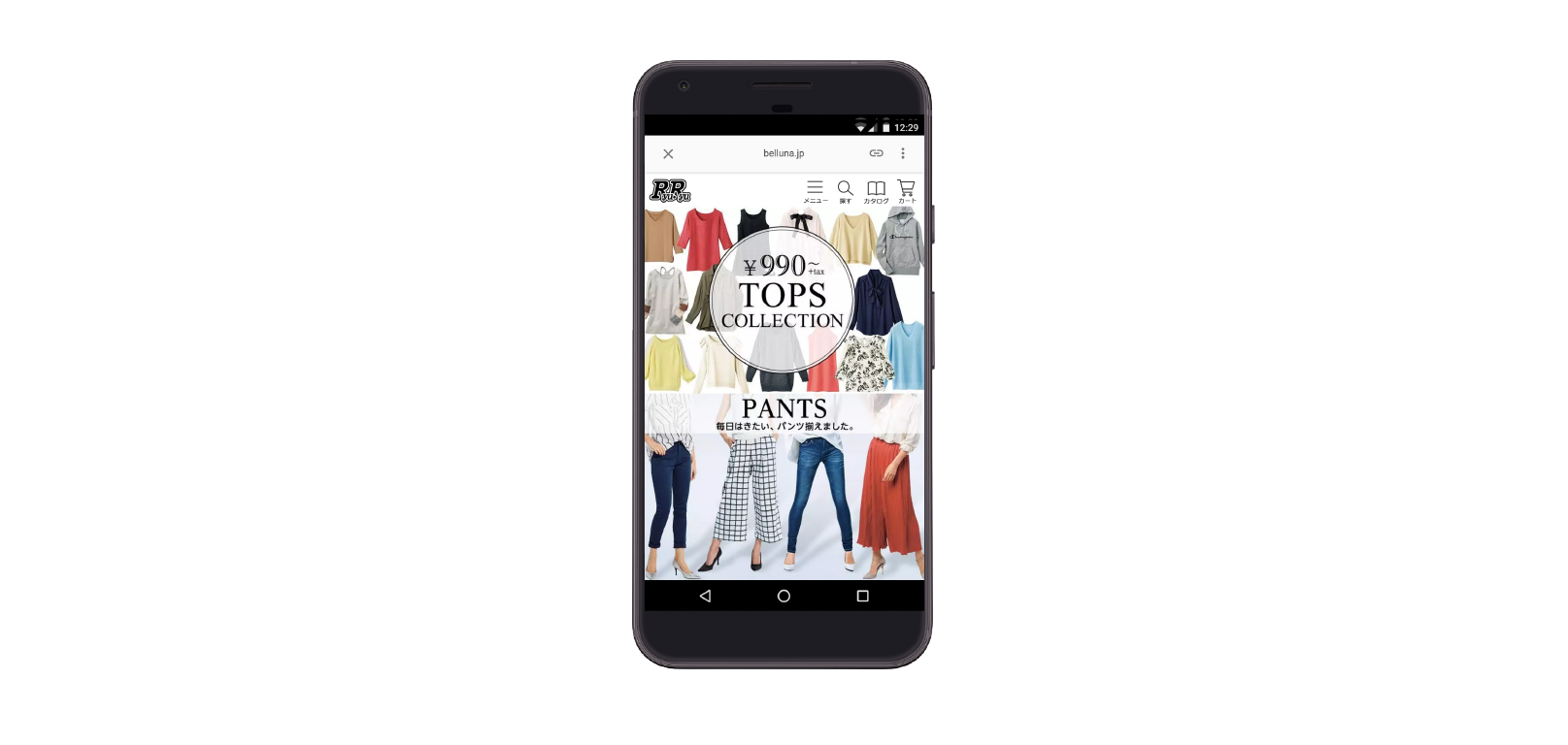
The first two steps in the improvement process created a smoother UX once users landed on the mobile site; Belluna went one step further and streamlined access to its site with a PWA. A PWA had the advantages of being easy for Belluna’s team to implement as well as functioning similarly to a normal app with immersive, full-screen displays and push notifications—all without requiring users to install an app. By preloading key resources and site elements, Belluna’s PWA launches and loads instantly to offer customers a fast, reliable, and engaging shopping experience.
The PWA drove a 60% increase in online order rate from home-screen icon users—a drastic improvement compared to orders placed via email, the brand’s main engagement channel in the past. On top of the lift in online orders, the average revenue per session on the PWA was 14% higher than on the mobile app.
Belluna’s new and improved mobile UX led to major sales success
The results of Belluna’s meticulous site improvement efforts exceeded all expectations. Belluna’s page loading speed improved by 35%, leading to a 28% increase in online orders from mobile users.

Belluna’s experience showed that removing lag and drag from the mobile UX is a win-win for brands and consumers alike. “The faster mobile site and improved UX have contributed to increased sales from our online store and improved the quality score of our online advertising,” said Satoshi Miyazaki of Belluna’s marketing department. “As smartphone ownership continues to rise in Japan, we will keep working on our mobile UX to increase sales and improve the efficiency of our marketing to attract more customers.”


