A real-time data visualization experience
The Story
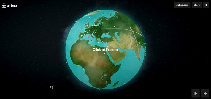
Airbnb has more than 1M accommodation listings in more than 190 countries, making it larger than any hotel chain. But some travelers continue to feel uncomfortable about staying in another person's home. To earn the trust of first-time users and demonstrate the popularity of staying in an Airbnb property, the company created a real-time data visualization of its global activity for the Airbnb website. Users can explore the map and zoom in on interesting Airbnb stories through iconic landmarks and playful animations.


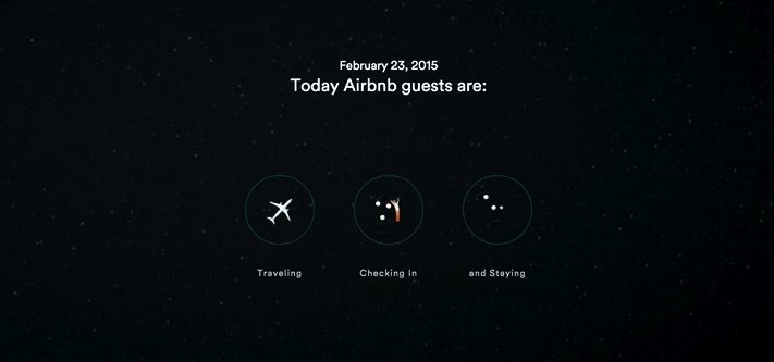
Airbnb created an interactive WebGL website to show how active the company is at any given moment. The site renders animations in real-time, including planes to represent trips, pulsing dots to show the scale and density of guest stays, and animated characters to represent new Airbnb stays. The company also built a reactive sound engine so users can hear a variety of soundscapes as they zoom around the globe. To expand the reach of the campaign, it was translated from a browser experience to mobile as well.
The Technology
Geo APIs:
Social:
- Google+
Video:
- YouTube
The Results
Launch date: January 8, 2015
Hosts, guests, and even celebrities posted about the campaign on social media, and positive press coverage proved the PR value of a real-time data campaign. In the first month following launch, the site received:
2M:
Pageviews
5:
Minutes of average engagement time per visit
The Team
Tool of North America
-
Ben Priddy, Creative Director & Dev. Lead
-
Michael Sevilla, Creative Director
-
Clay Weishaar, ACD
- Andrew Schapiro, Head of Art Department
- Peter Giorgi, Head of Advertising
- Willow Hill, Producer


