We’ve previously explored how brands can reach non-English speakers with local language messaging and voice technology. In our latest UX research and playbook, we go a step further to offer strategies and practical ways for brands to optimize the experience of Indian language websites and apps for hundreds of millions of Indian users.
In India, more than 50% of internet users have come online in the past five years,1 creating a major business opportunity for brands that cater to their needs with user-friendly Indian language websites and apps. To help brands build a better website and app experience for Indian language users, Google conducted an in-depth study on users’ behaviors and needs.
We found that nearly half of all India internet users prefer content exclusively in regional languages.2 By meeting this need, brands have been able to connect with people and unlock growth. For instance, when investment company HDFC Mutual Funds launched Hindi creatives and Hindi landing pages, and set up Hindi-speaking call centers, it achieved 2X incremental conversions at 40% lower cost per acquisition.
Marketers may be familiar with Indic language advertising strategies for TV, print, and other offline media, but apps and websites require an end-to-end localization strategy that goes beyond the usual approach of simple translations. To help brands go digital with the best app and website optimization, our research identifies the challenges Indian language users experience online and the ways to solve them.
Here are the five UX principles and corresponding actions that brands can take to optimize the digital experience for Indian language users across websites and apps.
1. Use simple, conversational language
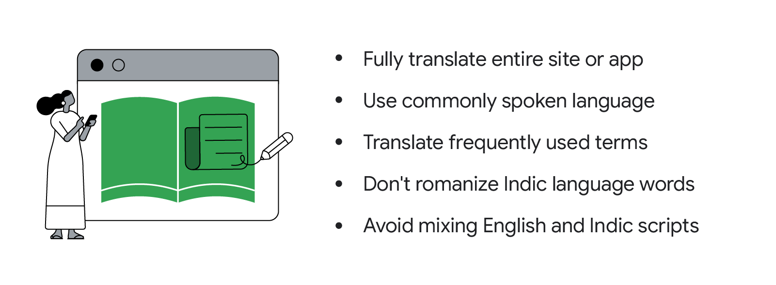
When people search the internet in Indian languages, they expect brands to deliver content in the same language. Brands should ensure their websites are fully translated to prevent users from abandoning the sites when they encounter untranslated content.
Brands should also use commonly spoken language that is easy to understand. Avoid direct translations because they may not be easily understood by most Indian language speakers. For instance, with “get quote,” Hindi speakers will recognize “जानें कि प्रीमियम कितना होगा” but not its formal expression “प्रीमियम का कोट पाएँ.”
Translating the most frequently used terms on your website thoughtfully will also help Indian language users. A travel website, for instance, should explain what domain-specific terms such as “flexi saver” and “baggage allowance” mean.
As far as possible, steer clear of romanizing Indian language words because this may confuse Indian language users. For instance, Tamil users will understand the verbal expression for “new” but not necessarily its transliterated form, “puthiya.”
Also, be sure to stick to a single script on your website instead of mixing Indian and English. A customer shopping for oil to prevent hair fall will understand “बालों को झड़ने से रोकने के लिए तेल लगाएँ” but not “hairfall को रोकने के लिए oil लगाएँ.” Common English acronyms and widely recognized English brand names are exceptions to this rule.
Do's and don’ts when translating Indian language sites and apps

2. Build digital confidence
For people new to online shopping, navigating virtual retail spaces may not be as intuitive as going to a store. They may struggle with everything from browsing and locating products, to figuring out how to pay for items online. Not knowing what to do next could frustrate shoppers and demotivate them from proceeding with a purchase. Guide people along with tooltips: show shoppers cues that say “click here to check out” or “continue shopping” so they know what to do next.
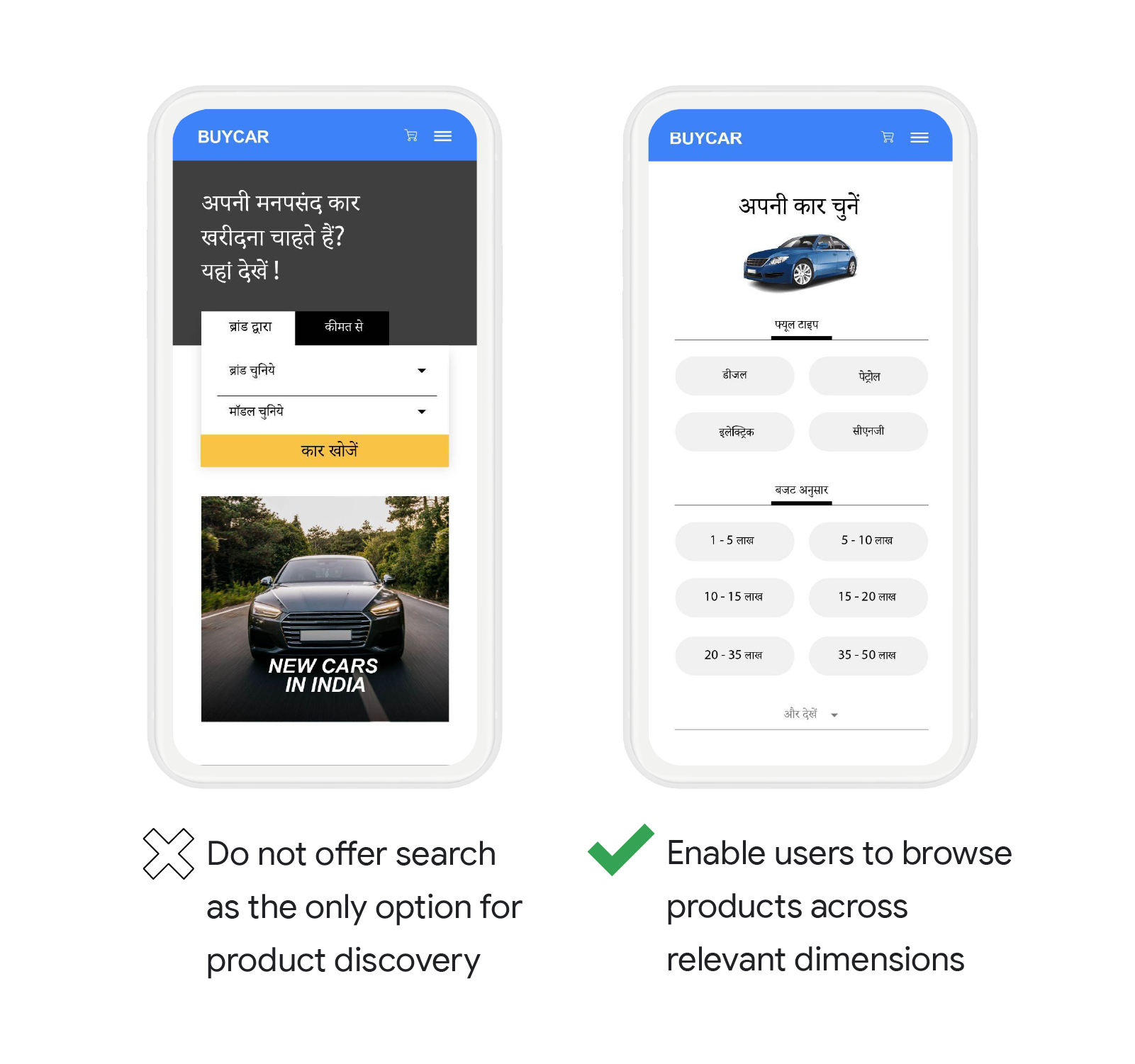
Brands can make it easier for shoppers to find what they’re looking for by providing simpler search options. Let people browse by price, brand, and category instead of requiring them to identify the right keywords to search for products.

Offering people help via call or chat functions also gives them the confidence to keep shopping online. However, many Indian language users avoid chat because they assume it only supports English. Brands can help by making Indic language chat options clear to users or by offering people the option to call.
3. Make key information easily discoverable
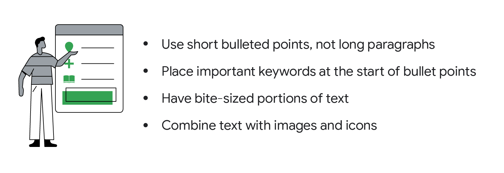
People typically scan websites for keywords and headlines to decide whether to stay on a page. Brands should therefore optimize landing pages with skimmable content in the following formats:

Make important information quickly and easily discoverable to nudge people along in their purchase journey. If people are looking for mobile phones on your page, for instance, they can reach a purchase decision more quickly if they have key information such as storage capacity, screen size, and price, at their fingertips. If you’re selling complex products such as insurance, make sure additional information is available through easy-to-understand definitions, infographics, or FAQs.
4. Communicate with visuals
Our study found that it’s far easier for Indian language users to understand content that’s supported with visuals than that with text alone. If someone is looking at color options for a shirt, for instance, consider including an image of the color alongside its text description.
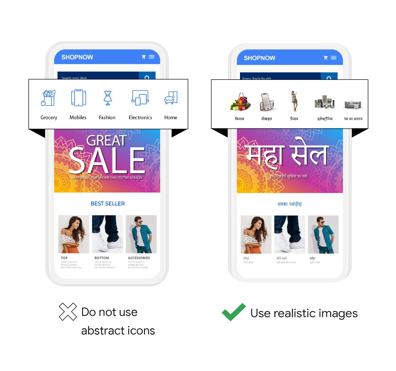
Remember that standalone symbols and icons may not always translate culturally, and people who fail to understand their meaning could be put off a purchase, so avoid abstract icons. Use self-explanatory visuals that immediately draw attention to the information that’s crucial to decision-making. A realistic image of a person trying on clothes rather than a clipart of a dress, for example, will signal the fashion section on an app or website more clearly.

5. Provide voice, autocomplete, and text scanning input options
Our study found that it may be easier for people to use voice input to search than type in an Indian script. To optimize landing pages for Indian language users, accept voice input wherever possible. Additionally, ensure autocomplete recognizes transliterated text in various Indian languages, so search queries can be automatically filled out for people who prefer typing in Roman script.
Brands can also offer a text scanning feature to assist users when entering information in English is necessary. For instance, when people are buying travel tickets, text scanning helps them automatically fill out online forms by simply scanning their passports and extracting the necessary information.
There’s an incredible opportunity for brands to make meaningful connections with the growing number of internet users in India and those who want content in their native language. Applying these five UX principles will help you optimize your websites and apps for Indian language users and offer them an online experience that will keep them coming back for more.
Contributors: Joe Koshy, Research Project Manager, Consumer & Market Insights; Bhavinee Vyas, UX Researcher — NBU Search Ads; Anurag Sharma, Hindi Language Manager


