Risa Wexler, head of Pfizer’s Media Lab, shares why the pharmaceutical company refocused its mobile experience, prioritizing speed and accessibility, to deliver its best customer experiences yet.
Our challenge at Pfizer is the same as every company operating today: navigating how we do business in a world that’s moving at breakneck speed. I don’t think any 10-year span in the last 100 years has moved as quickly in terms of our ability to connect, to learn, and to inspire.
But our patients’ basic needs have remained the same. That is, they don’t want to be patients. They want to be healthy — or to get healthy as fast as they can. What has changed is how patients navigate their own health care. Thanks to mobile, it’s easier than ever to access information, and patients and caregivers can take some power back.

Aiding people in this empowerment is critical if we want to stay relevant. And we recognized the most effective way to do this was through mobile. It’s the one resource almost everybody, regardless of age, has in their pocket. And just because many patients are over 50 doesn’t mean they aren’t using mobile. It certainly doesn’t mean they’ll tolerate a mediocre mobile experience.
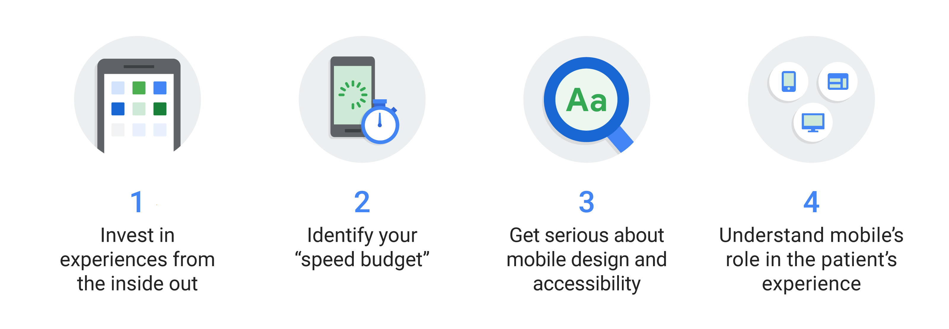
Invest in experiences from the inside out
We evaluated our mobile efforts and saw we could do better in delivering on our patients’ needs. Our sites weren’t fast, weren’t accessible, and didn’t offer great experiences.
One of our sites took 21 seconds to fully load. Twenty-one seconds! Most people would be like, “No, thanks, I don’t have time for this.” And they would abandon the site, perhaps without getting the information needed to make an informed health care decision.
We needed a strategy to fix that, but first, we had to get everyone at Pfizer on board with this change. We got our marketers and senior leaders in the same room, outside of our day-to-day in the office. There, we partnered with Google and spent time looking through our portfolio of sites. What the team saw made them realize we needed to do better for patients.
The notion of rebuilding our mobile experience seemed less daunting to everyone afterward. We were all aligned, and we could start working on solutions.
Set a mobile ‘speed budget’
We have about 40 promoted brands at Pfizer, with 12 to 15 operating full-throttle sites with lots of functionality at any one time. We were seeing similar mobile speed problems across our whole portfolio. So we introduced the idea of setting a “speed budget,” the amount of time we’ll accept for a site to load.
Now, it takes about three to five seconds for any of our sites to fully load. The notion of a budget really resonated with a lot of people here because people could associate the concept with their daily lives. Any new images or functionality that we introduce into a site can’t blow our “speed budget.” We’re ruthless with this, and often it means something else has to go.
By prioritizing mobile speed, we’re able to get more information to more patients to help them more quickly navigate their own health care.
We also developed a new generic site infrastructure so we could adapt and scale quickly for each brand. And it worked: The site that took 21 seconds to fully load? Now it takes 5.2 seconds.
Overall, our sites load 38% faster, and our bounce rate has been reduced by 20%. By prioritizing mobile speed, we’re able to get more information to more patients to help them more quickly navigate their own health care. That’s powerful.
The bottom line is, if you’re spending a lot of time and energy getting people to your mobile site, it makes sense to offer the fastest experience possible. You’ll risk losing your customers if you don’t. For us, we may lose the opportunity to give a patient health care information they need, so this drives us to do better in all areas, even site load time.
Get serious about mobile design and accessibility
Mobile is great at helping people cut through the clutter. But that requires creating experiences that are just for mobile. While there are similarities between desktop and mobile, creating a mobile-responsive site for both platforms should only be a temporary fix. It’s critical to build for each platform so you’re providing the experience people expect, regardless of the platform on which they seek your information.
If you’re spending a lot of time and energy getting people to your mobile site, it makes sense to offer the fastest experience possible.
To anticipate those expectations, make your site accessible to audiences by addressing their navigation pain points. As I mentioned, many of our patients are over 50. While they’re not millennials, they also haven’t just been dropped into a strange technology land. These are people who were 20 and 30 years old during the dot-com boom. They understand the value of mobile and use it every day. Still, we try to understand their information pain points and solve them by creating sites with larger fonts, for instance.
We also kicked off our “digital wallet” initiative. It’s our copay card version of checking in at the airport on your phone. Patients don’t need to remember key chain tags, passwords, or which phone number to plug in where. They can complete the whole transaction via their phone with their mobile wallet.
Understand mobile’s role in the customer experience
It’s critical to remember that mobile is just one part of the user experience — a big and important part, sure — but you still need to think about how it works alongside other channels, like TV or print. Your customers aren’t interacting with you in just one way. You have to deliver a cohesive experience that will surprise and delight, regardless of device. Understand what they need and provide that as best as you can. Our patients are depending on us to do just that.


