Art, Copy & Code partners with innovative brands and agencies to push the digital advertising envelope. The results have been impressive. But our goal in this article is to be eye-opening. We want to reveal the magic behind two of the project's campaigns—Burberry Kisses and Volkswagen's SmileDrive—and to highlight the tools and techniques that made them possible. You'll see that you don't need to be Houdini to captivate audiences or to be a big brand with tons of money. All you need is technology, creativity, and an open mind.
There’s a common saying around here that ads are windows to the web. And anything you can do on the web, you should be able to do in an ad. We try to put that theory to the test through every project we take on.
Rather than just giving people a call to action, advertisers are striving to engage and even entertain. Advancements in ad technology—and technology in general—are helping make that happen. And it's not just big brands with tons of money that can accomplish these feats. The technology is available to everyone. You may already be using it.
Here we take a look at some of the technologies behind two successful projects from our emerging Art, Copy & Code initiative: Burberry Kisses and Volkswagen SmileDrive. Both campaigns are built using a combination of open web standards—HTML5, WebGL, and WebP, for example—and Google products.
While very different, Kisses and SmileDrive shared common goals: create unique experiences with which customers would engage across devices. Both brands accomplished their goals and managed to challenge convention along the way.
Burberry sends Kisses across screens
Burberry Kisses was developed to help the 157-year-old iconic fashion brand connect with a younger audience. The company saw this campaign as an opportunity to try something new and different in the display space.
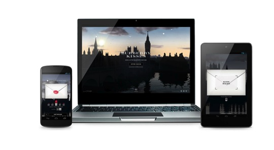
Playing on the universal theme of love, we—Burberry, Grow, and Google—created a web experience that let users send a digital note to a loved one and seal it with a kiss from their own lips. Senders could then watch as that letter traveled across the globe to its recipient with Google Earth, Maps, and Street View. This provided a variety of 3D and realistic photography of each place, making the experience much more real and personal for users.
Drew Ungvarsky, Grow's executive creative director, believes it was the campaign's play on old and new ideas that helped bring Burberry Kisses to life. Taking a universal theme and giving it a tech touch is what Drew believes makes Kisses unique. It's a simple concept but the technology behind it is quite complex.
The technology Drew refers to is a combination of three open web standards: WebGL, HTML5 and CSS3. They allowed Grow to bring the Burberry Kisses experience to life across screens—desktop, tablet, and phone—with the same level of engagement.

The team built Kisses to live on Burberry.com and then scaled it to other platforms. This ‘”build once, run everywhere” approach was key, and it was largely possible because of HTML5 and the flexibility of the Lightbox ad unit, which was the primary ad format used throughout the campaign. The technology, which works across desktop, tablet, and mobile browsers, allows you to deliver a similar interactive experience to users no matter what kind of device they're using.
This cross-screen approach wasn't without its challenges, though. The webcam technology used to capture the kiss on a desktop was not yet available on smartphones or tablets. So, when it came time to figure out how to capture the "kiss" on mobile devices, Grow looked at the unique form factors of mobile devices. "We used the touch screen to recognize lips," Drew said. "The mobile device can recognize touch duration, as well as the distance between touchpoints, so in a different way we achieved the same brand experience across screens." We also found that, when people use more of their senses when engaging with an ad, it immediately becomes more personal.
Helping deliver on engagement was the Lightbox ad format, an expandable engagement ad that uses hover technology. It's been a game changer. Marrying the basic ad unit—the 300x250 you see everywhere—with a much larger (900x600), expanding rich media canvas, you can potentially reach millions of people with truly eye-catching creative. But the best part of these ads is that they aren't in-your-face intrusive. Users need to hover on them for a full two seconds before they expand, creating a website-like experience. This is qualified engagement, and advertisers only pay when that happens.
And engage they did . . . for three whole minutes. Whether they experienced Kisses through the web or an ad, users spent about the same amount of time with the campaign.
Volkswagen quickly drives traffic to SmileDrive
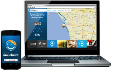
Volkswagen and their agencies, Deutsch LA and Use All Five, approached the ads for the SmileDrive app with similar multi-screen ambitions. The app lets Volkswagen drivers capture data about their road trips, including miles driven, location and weather, as well as share info via status updates and photos. The goal was to focus on the fun of driving.

Like Burberry, Volkswagen also used the Lightbox format to showcase SmileDrive's bells and whistles—something that would not have been possible with traditional display ads. HTML5 provided a rich canvas for the ad content, which was culled from the experiences of real users. These "voyagers" were selected by Volkswagen because of their active social roles on Google+ and YouTube. Equipped with an Android phone, the SmileDrive app, and a VW loaner, they hit the road to document their road trips. These adventures became the fodder for a series of display ads, which featured the maps, routes, photos, comments, and more. Any user could +1 these ads or follow the voyager on Google+, right from the ad unit. This built-in social sharing allowed word of mouth to really drive the campaign.
To make sure Volkswagen reached the right users with these ads, it looked to Custom Affinity Segments within the Google Display Network. Based on previous browsing behavior, it found a cross-section of people who spent time on the web looking for all things VW and visited Android-related sites, reading about apps and hardware—precisely the audience for SmileDrive. This custom segment targeting helped achieve an engagement rate that was 3X the industry average.
The ability to capture engagement metrics was key. Using DoubleClick Rich Media reporting, the teams could track and compare user retention at key intervals of the video. The creative team obtained data about viewer retention on an existing 90-second spot, then used plug-and-play layouts in DoubleClick Studio to quickly build an ad running a 30-second video (using existing assets) and A/B tested the two. In the end, their performance was comparable, but having the ability to quickly and easily adapt content was immensely useful.
Born from simple, universal ideas, these two campaigns—Burberry Kisses and Volkswagen SmileDrive—took different routes to deliver innovative experiences. Burberry used modern browser capabilities, such as HTML5 and WebGL, to create fully custom, complex creative. Volkswagen, on the other hand, needed something quick and easy, so it turned to DoubleClick to test and scale existing creative. Both approaches demonstrate the massive flexibility of ad creative that's available to marketers—something they're embracing more and more. The result, as it was for these two brands, can be incredibly creative yet unobtrusive ad experiences that users are happy to engage with and brands can strategically target, adapt, and measure.


